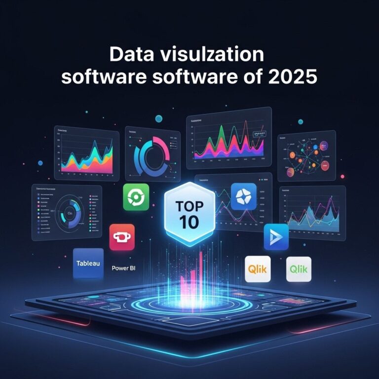
In today’s data-driven world, the demand for effective data visualization tools is more crucial than ever. Organizations are flooded with vast amounts of data, and transforming this data into compelling visuals is essential for making informed decisions. Data visualization software enables users to create graphical representations of data, allowing for easier interpretation and analysis. In this article, we will explore the top five data visualization software tools that professionals should consider adding to their toolkit.
1. Tableau
Tableau is one of the leading data visualization tools on the market. Renowned for its user-friendly interface, Tableau allows users to create interactive and shareable dashboards. Here are some key features:
- Drag-and-drop Interface: This feature simplifies the process of building visuals without needing deep programming knowledge.
- Data Connectivity: Tableau connects to various data sources, including spreadsheets, databases, and cloud services.
- Real-time Data Analysis: Users can visualize data in real-time, enabling immediate insights.
Benefits of Using Tableau
- Enhanced Decision-Making: With clear visuals, teams can make quicker and more informed decisions.
- Collaboration: Dashboards can be easily shared across teams, promoting collaborative efforts.
- Scalability: Tableau can handle large sets of data efficiently, making it suitable for businesses of all sizes.
2. Power BI
Power BI, developed by Microsoft, is another powerful tool that integrates seamlessly with various Microsoft products. It’s ideal for organizations already using Microsoft products and services. Key features include:
- Integration: Strong integration with Excel and Azure allows for smooth data management.
- Natural Language Query: Users can ask questions in plain English and get instant visualizations.
- Custom Visuals: Users can create custom visuals from scratch or choose from a library of existing ones.
Advantages of Power BI
- Cost-Effective: With several pricing tiers, including a free version, Power BI is accessible for startups and large enterprises.
- Mobile Access: Dashboards can be accessed on mobile, ensuring insights on the go.
- Frequent Updates: Microsoft regularly updates Power BI, adding new features based on user feedback.
3. Qlik Sense
Qlik Sense is a self-service data analytics tool known for its associative model, which allows users to explore data from all angles. Its features include:
- Smart Search: Qlik Sense enables users to search for any data point across the entire dataset.
- AI-Powered Insights: The tool uses AI to recommend data visualizations based on users’ needs.
- Responsive Design: The platform is designed to be mobile-friendly, adapting visuals for various devices.
Why Choose Qlik Sense?
- Agility: The tool allows users to quickly build visualizations without IT involvement.
- Data Literacy: Qlik Sense promotes data literacy among users through intuitive interfaces.
- Collaboration: Multiple users can work on the same data visualization project simultaneously.
4. D3.js
D3.js is a JavaScript library for producing dynamic, interactive data visualizations in web browsers. It’s a popular choice for developers and data scientists looking for flexibility in their visualizations. Here are some highlights:
- Customization: D3.js provides unparalleled control over the final visual appearance, allowing developers to create any type of chart or diagram.
- Data Binding: It binds data to the Document Object Model (DOM) and enables updates without needing to reload the entire page.
- Reusability: Developers can create reusable components across projects.
Considerations for Using D3.js
- Steeper Learning Curve: Unlike other tools, D3.js requires programming skills, making it less accessible for non-developers.
- Browser Compatibility: Users need to ensure visualizations function correctly across different web browsers.
- Time-Consuming: Building and optimizing custom visualizations can take more time compared to standard tools.
5. Google Data Studio
Google Data Studio is a free tool that transforms data into customizable informative reports and dashboards. Its key features include:
- Google Integration: Seamless integration with Google Analytics, Google Ads, and other Google services.
- Collaboration: Multiple users can edit reports in real-time, making teamwork efficient.
- Easy Sharing: Reports can be easily shared via links or embedded on websites.
Benefits of Google Data Studio
- Free of Cost: Offers a comprehensive set of features at no cost, making it a great choice for small businesses.
- User-Friendly Interface: Designed for users of all skill levels, from novice to expert.
- Customizability: Users can build reports according to specific needs with ease.
Conclusion
Choosing the right data visualization tool depends on the specific needs of your organization and the skillset of your team. Whether you prefer a user-friendly platform like Tableau or a developer-centric library like D3.js, each tool offers unique features that can enhance your data analysis and presentation capabilities. By leveraging these top five data visualization software tools, organizations can turn raw data into actionable insights, driving success in their respective industries.
FAQ
What are the top data visualization software tools available?
The top data visualization software tools include Tableau, Microsoft Power BI, QlikView, D3.js, and Google Data Studio, each offering unique features for data analysis and visualization.
How does Tableau enhance data visualization proficiency?
Tableau enhances data visualization proficiency by providing an intuitive drag-and-drop interface, allowing users to create interactive and shareable dashboards easily without extensive programming knowledge.
What features make Microsoft Power BI a preferred choice for data visualization?
Microsoft Power BI is preferred for its seamless integration with other Microsoft products, real-time data access, and robust analytics capabilities, making it suitable for both beginners and advanced users.
Can D3.js be used for interactive data visualizations?
Yes, D3.js is a powerful JavaScript library that allows developers to create highly interactive and customizable data visualizations for web applications, offering extensive control over the final output.
Is Google Data Studio suitable for beginners in data visualization?
Yes, Google Data Studio is user-friendly and designed for beginners, providing a straightforward way to create reports and dashboards using data from various sources with minimal effort.