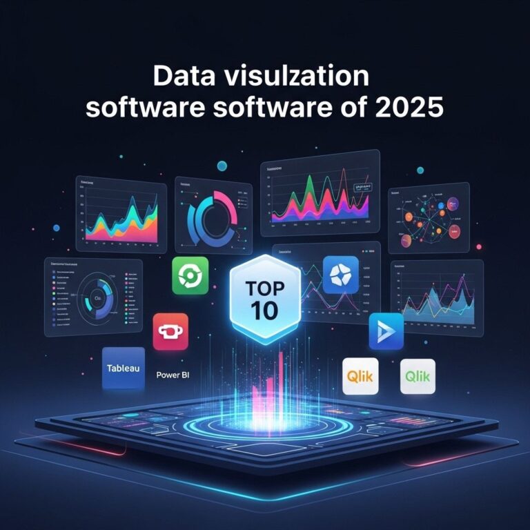
In today’s data-driven world, the ability to visualize data effectively has become crucial for businesses and organizations. Data visualization software enables users to convert raw data into understandable, visually appealing graphics, which can lead to insightful decision-making. This article explores the top 10 data visualization software examples that cater to various needs and preferences, allowing users to transform their datasets into compelling visual stories.
1. Tableau
Tableau is a leading data visualization tool known for its user-friendly interface and powerful analytics capabilities. It allows users to create a variety of visualizations without extensive programming knowledge.
Key Features:
- Drag-and-drop interface for easy data visualization
- Wide range of chart types and dashboards
- Real-time data analytics
- Integration with various data sources
2. Microsoft Power BI
Microsoft Power BI is a robust business analytics tool that provides interactive visualizations and business intelligence capabilities. It is part of the Microsoft ecosystem, making it an excellent choice for users familiar with Microsoft products.
Advantages:
- Simplified sharing and collaboration features
- Integration with Excel and other Microsoft apps
- Customizable dashboards and reports
3. QlikView
QlikView is an in-memory data visualization and business intelligence tool. It allows users to analyze and visualize data from various sources and provides powerful associative data modeling capabilities.
Benefits:
- Associative data model for deeper insights
- Robust security features
- Mobile accessibility
4. D3.js
D3.js is a JavaScript library for producing dynamic, interactive data visualizations in web browsers. Unlike other software, it requires coding knowledge, making it suitable for developers looking to create custom visualizations.
Why Choose D3.js?
- Highly customizable and flexible
- Supports large datasets and real-time data updates
- Wide range of visualization types, from basic to complex
5. Google Data Studio
Google Data Studio is a free tool that transforms your data into customizable informative reports and dashboards. It’s particularly beneficial for users who rely on Google products, as it integrates seamlessly with them.
Features:
- Real-time collaboration capabilities
- Integration with Google Analytics, Google Ads, and more
- Variety of templates and design options
6. Looker
Looker, now a part of Google Cloud, offers powerful data exploration and visualization capabilities. It allows users to create complex data models and visualizations using LookML, a modeling language.
Notable Aspects:
- Web-based interface for easy access
- Collaboration features for team projects
- Integration with other Google Cloud services
7. SAP Lumira
SAP Lumira is a data visualization tool designed for business users. It provides an intuitive interface that enables users to create stunning visualizations and infographics from their data.
Highlights:
- Self-service data preparation and visualization
- Wide range of visualization options
- Integration with SAP and non-SAP data sources
8. Sisense
Sisense is an end-to-end data analytics platform that enables users to prepare, analyze, and visualize data seamlessly. It is particularly known for its ability to handle large datasets effectively.
Features:
- In-chip technology for faster performance
- Embedded analytics for application integration
- AI-driven analytics capabilities
9. Chart.js
Chart.js is an open-source JavaScript library that enables users to create simple yet flexible chart visualizations for web applications. It is perfect for developers looking for straightforward solutions.
Pros:
- Easy to use and integrate into web projects
- Supports various types of charts and animations
- Lightweight and minimalistic
10. Infogram
Infogram is a web-based tool that allows users to create infographics and reports easily. It provides a variety of templates and design elements, making it accessible for non-technical users.
Benefits:
- User-friendly drag-and-drop interface
- Wide range of templates and customization options
- Interactive charts and maps
Conclusion
Choosing the right data visualization software depends on your specific needs, technical skills, and the complexity of your data. Each of the tools listed above offers unique features and advantages, making them suitable for different use cases. Whether you need deep analytics or a simple way to create charts, there is a solution available that can help you unleash the power of your data through visualization.
FAQ
What are the best data visualization software options available?
Some of the top data visualization software examples include Tableau, Power BI, Google Data Studio, QlikView, D3.js, and Microsoft Excel.
How does Tableau stand out among data visualization tools?
Tableau is known for its user-friendly interface and powerful data analysis capabilities, allowing users to create interactive and shareable dashboards.
Is Power BI suitable for beginners in data visualization?
Yes, Power BI offers a range of templates and an intuitive interface that makes it accessible for beginners while still providing advanced features for experienced users.
What is the advantage of using D3.js for data visualization?
D3.js is highly customizable and allows developers to create complex and dynamic visualizations using web standards like SVG, HTML, and CSS.
Can I use Google Data Studio for real-time data visualization?
Yes, Google Data Studio allows users to connect to various data sources in real-time, making it a great option for live data visualization.
What types of businesses benefit from using data visualization software?
Businesses of all sizes and industries can benefit from data visualization software, as it helps in making data-driven decisions, improving communication, and enhancing overall productivity.