In today’s fast-paced digital landscape, the need for clear and effective data visualization has never been greater. As organizations collect vast amounts of data, the ability to transform that data into insightful visual representations is crucial for informed decision-making. Whether in the realms of business analytics, research, or even personal projects, the right data visualization software can make all the difference.
Understanding Data Visualization
Data visualization is the graphical representation of information and data. By using visual elements like charts, graphs, and maps, data visualization tools provide an accessible way to see and understand trends, outliers, and patterns in data. The importance of data visualization lies in the following:
- Enhances data comprehension
- Facilitates decision making
- Uncovers insights through visual storytelling
- Enables quick analysis of complex information
Criteria for Selecting Data Visualization Software
With numerous tools available, selecting the right data visualization software can be daunting. Here are key criteria to consider:
1. User-Friendly Interface
A good software should have an intuitive interface that allows users, regardless of their technical expertise, to create visualizations easily.
2. Variety of Visualization Options
The software should provide diverse options such as bar graphs, pie charts, heat maps, and more to cater to different data representation needs.
3. Integration Capabilities
Compatibility with existing data sources and software is crucial. The ability to integrate with databases and cloud services simplifies the data handling process.
4. Customization Features
Data visualization should allow users to tailor visual outputs according to their branding or project requirements.
5. Collaboration Tools
In a team environment, features that support collaboration and sharing are essential for enhancing productivity.
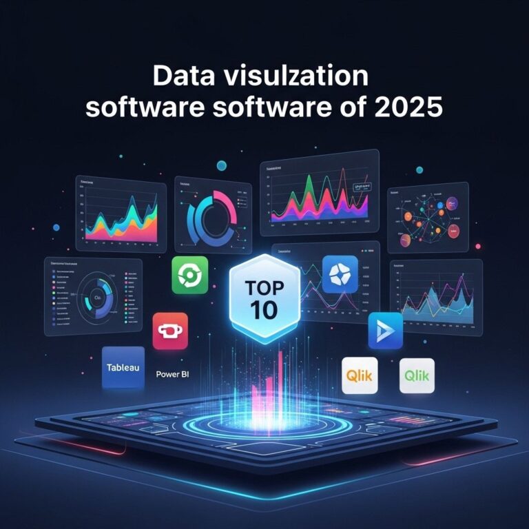
Top Data Visualization Software Examples for 2025
Based on trends and advancements in technology, below are ten data visualization software platforms that are expected to stand out in 2025:
1. Tableau
Tableau remains a leader in the field of data visualization. With its powerful analytics features and user-friendly interface, it allows users to create stunning interactive visualizations quickly. Its integration with multiple data sources makes it a preferred choice for businesses of all sizes.
2. Power BI
Microsoft’s Power BI is a robust analytics service that provides interactive visualizations with a user-friendly interface. It’s particularly well-suited for organizations already using Microsoft products.
3. Looker
Looker is a data exploration and discovery tool that allows businesses to analyze data in real time. Known for its modeling language, LookML, it allows for a high level of customization in visualizations.
4. D3.js
A JavaScript library for producing sophisticated data visualizations. It is highly flexible and allows developers to create custom solutions, making it a favorite among tech-savvy users.
5. Qlik Sense
Qlik Sense is a self-service data analytics tool that empowers users to create personalized reports and dashboards. It’s renowned for its associative data modeling feature, which makes data connection intuitive.
6. Google Data Studio
This free tool from Google allows users to transform data into customizable informative reports and dashboards. Its easy-to-use interface and seamless integration with other Google products make it ideal for beginners.
7. Infogram
Infogram is known for its ease of use, allowing users to create infographics and reports quickly. It is especially valuable for marketing teams needing to create visually appealing data presentations.
8. Sisense
Sisense allows users to easily prepare, analyze, and visualize complex data. Its unique In-Chip technology allows for faster data processing and real-time analytics.
9. Plotly
Plotly is a versatile platform that allows users to create interactive graphs and dashboards. It is highly favored in the scientific and academic community due to its powerful capabilities in statistical visualizations.
10. Chartio
Chartio is designed for data exploration and visualization, with an emphasis on ease of use for non-technical users. It allows for real-time data querying and dashboard creation.
Features Comparison Table
| Software | User Interface | Integration | Collaboration |
|---|---|---|---|
| Tableau | User-friendly | Multiple data sources | Excellent |
| Power BI | Simple | Microsoft products | Good |
| Looker | Customizable | Real-time | Moderate |
| D3.js | Developer-focused | Custom integrations | Limited |
| Qlik Sense | Intuitive | Various | Good |
| Google Data Studio | Easy | Google services | Excellent |
| Infogram | Simple | Limited | Good |
| Sisense | User-friendly | Multiple | Moderate |
| Plotly | Advanced | Custom | Limited |
| Chartio | Simple | Multiple | Good |
Future Trends in Data Visualization
As technology continues to evolve, so too will the field of data visualization. Here are some anticipated trends for the near future:
- AI-Driven Visualizations: The integration of artificial intelligence to assist in the selection of visualization types and design choices will become common.
- Augmented and Virtual Reality: As AR and VR technology advance, new immersive data visualization experiences will emerge, providing deeper insights through interactive environments.
- Real-Time Data Processing: With the growth of IoT, real-time data visualization capabilities will be essential for timely decision-making.
- Increased Customization: Users will expect more personalized visualization experiences tailored to their specific needs and preferences.
Conclusion
Selecting the right data visualization software is vital for effectively communicating insights derived from data. As we look ahead to 2025, tools like Tableau, Power BI, and D3.js are expected to remain at the forefront of innovation, each catering to unique user needs. By considering factors such as ease of use, integration capabilities, and collaboration features, organizations can choose the software that best aligns with their goals. Embracing the latest trends in data visualization will enable businesses to stay competitive in a data-driven world.
FAQ
What are the top data visualization software examples for 2025?
The top data visualization software examples for 2025 include Tableau, Power BI, Qlik Sense, D3.js, Google Data Studio, and Looker, among others.
Why is data visualization important?
Data visualization is important because it helps to make complex data more accessible, understandable, and actionable, allowing organizations to make informed decisions.
What features should I look for in data visualization software?
Look for features such as user-friendly interface, integration capabilities, real-time data processing, customization options, and strong analytical tools.
How can data visualization improve business performance?
Data visualization can improve business performance by providing insights that drive strategic planning, enhance operational efficiency, and identify market trends.
Is there free data visualization software available?
Yes, there are several free data visualization tools available, such as Google Data Studio, Tableau Public, and Chart.js, which offer basic functionalities.
What industries benefit most from data visualization?
Industries such as finance, healthcare, marketing, and education benefit significantly from data visualization by enabling better data analysis and decision-making.