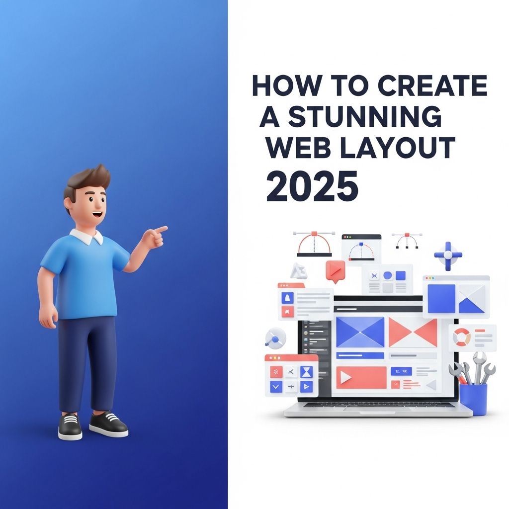
Creating a visually appealing and functional web layout is essential in today’s digital landscape. With the rapidly evolving trends and technologies in web design, it’s crucial for web designers to stay ahead of the curve. In this article, we will explore innovative techniques and best practices for crafting a stunning web layout that not only captivates users but also enhances their overall experience.
Understanding Modern Web Design Trends
Before diving into the specifics of creating a web layout, it’s important to understand the trends that are shaping the industry. Below are some key trends that are expected to dominate in 2025:
- Minimalism: Simplified designs that focus on essential elements.
- Dark Mode: Increased popularity of dark themes for improved readability and aesthetics.
- Asymmetrical Layouts: Unique, non-traditional arrangements that draw attention.
- Micro-animations: Subtle animations that enhance user interaction.
- Augmented Reality (AR): Integration of AR elements for immersive experiences.
Defining the Purpose of Your Layout
The first step in creating a stunning web layout is to define its purpose. Ask yourself the following questions:
- What is the main goal of the website?
- Who is the target audience?
- What actions do you want users to take?
Having a clear understanding of your website’s objectives will guide your design decisions and help you create a layout that effectively meets user needs.
Choosing the Right Structure
There are several structural patterns that you can choose from when designing your web layout. Here are some popular options:
Grid Layout
A grid layout is a powerful tool that allows you to create a balanced and organized design. It involves dividing the page into a series of rows and columns, which can make it easier to align elements visually.
F-Layout
This layout mimics the way people naturally read text on a screen (left to right, top to bottom). It focuses on placing key elements along the F-shape to draw attention to important content.
Z-Layout
The Z-layout is effective for websites with a clear call to action. It guides the user’s eye in a Z-pattern, making it easy to navigate from one section to another.
| Layout Type | Best For |
|---|---|
| Grid Layout | Content-heavy websites |
| F-Layout | Text-based content |
| Z-Layout | Promotional pages |
Utilizing Color and Typography
Color and typography play a vital role in your web layout. Here are some tips to get it right:
Color Schemes
Select a color palette that reflects your brand identity and evokes the desired emotions. Tools like Coolors or Adobe Color can help you create beautiful color schemes.
Typography
Choose fonts that are easy to read and align with your brand. Consider the following:
- Limit the number of fonts to two or three.
- Use contrasting styles for headings and body text.
- Ensure accessibility by selecting legible sizes and weights.
Creating Visual Hierarchy
Visual hierarchy refers to the arrangement of elements in a way that signifies importance. To establish a strong visual hierarchy:
- Size: Make important elements larger.
- Color: Use bolder colors for calls to action.
- Position: Place critical information at the top of the page.
Incorporating Imagery and Media
Images and videos can greatly enhance your web layout. Here’s how to effectively incorporate them:
Images
Use high-quality images that are relevant to your content. Optimize image sizes to improve loading speeds. Consider:
- Using SVGs for logos and icons.
- Incorporating background images with overlays.
- Selecting stock images that resonate with your audience.
Videos
Embedding videos can increase engagement. Ensure they are:
- Relevant to the page content.
- Optimized for different devices.
- Muted by default if they autoplay.
Responsive Design for All Devices
In 2025, it’s imperative that your web layout is responsive. Here are some best practices:
- Use CSS media queries to adjust layout based on screen size.
- Test your design on various devices, including smartphones and tablets.
- Utilize a mobile-first approach to prioritize mobile users.
Testing and Iteration
The final step in creating a stunning web layout is testing and iteration. Gather user feedback and utilize tools like A/B testing to evaluate design elements. Here’s a simple process to follow:
- Launch a beta version of your website.
- Collect data on user behavior.
- Make adjustments based on insights gathered.
Conclusion
Designing a stunning web layout in 2025 requires a careful consideration of trends, structure, colors, typography, imagery, and responsiveness. By understanding modern design principles and continuously iterating based on user feedback, you can create a web layout that not only looks great but also delivers a superior user experience. Remember, the key to a successful web layout is to keep the user at the center of your design choices.
FAQ
What are the key elements of a stunning web layout in 2025?
A stunning web layout in 2025 should include a clean design, responsive elements, intuitive navigation, engaging visuals, and optimized typography.
How does responsive design impact web layouts?
Responsive design ensures that your web layout adapts seamlessly to different screen sizes, enhancing user experience across devices.
What design trends should I follow for web layouts in 2025?
In 2025, focus on minimalism, dark mode, micro-interactions, and bold typography to create visually appealing web layouts.
How can I improve user engagement through my web layout?
Improving user engagement can be achieved by using clear calls-to-action, interactive elements, and a well-structured layout to guide users.
What tools are recommended for creating web layouts in 2025?
Popular tools for creating web layouts in 2025 include Figma, Adobe XD, and Webflow, which offer robust features for design and prototyping.
Why is accessibility important in web layout design?
Accessibility is crucial in web layout design to ensure that all users, including those with disabilities, can navigate and interact with your website effectively.


