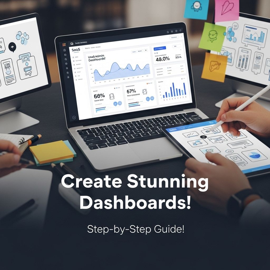
Creating a stunning SaaS admin dashboard template is a crucial step in the development of any software as a service application. An admin dashboard serves as the control panel for users, providing critical insights, analytics, and actionable data. In this article, we will explore the essential components of an effective dashboard, design principles, and best practices to enhance user experience.
Understanding the Purpose of an Admin Dashboard
The primary goal of an admin dashboard is to present key metrics and insights in a way that enables users to make informed decisions quickly. A well-designed dashboard should:
- Display relevant data at a glance.
- Allow for easy navigation and interaction.
- Provide customization options.
- Maintain clarity and simplicity.
Key Metrics to Include
When designing your dashboard, it’s important to prioritize the metrics that matter most to your users. Common metrics include:
- User engagement statistics
- Sales performance
- Customer feedback ratings
- Server uptime and performance
- Financial summaries
Choosing the Right Design Framework
Design frameworks play a significant role in how your dashboard will look and function. Some popular frameworks include:
| Framework | Features | Best For |
|---|---|---|
| Bootstrap | Responsive design, extensive components | Rapid development |
| Material UI | Material design principles, customizable | Modern, visually appealing dashboards |
| Ant Design | Rich set of components, enterprise-level design | Complex applications |
Layout Considerations
Effective layout is essential for usability. Here are some tips for layout design:
- Use a grid system for alignment and consistency.
- Prioritize the most important information at the top left of the dashboard.
- Group related information together to facilitate user comprehension.
Enhancing User Experience
User experience (UX) is paramount in designing an admin dashboard. Here are some strategies to enhance UX:
Color and Typography
Choosing the right color scheme and typography can significantly affect the readability and appeal of the dashboard. Consider the following:
- Use a cohesive color palette that aligns with your brand.
- Opt for legible fonts; sans-serif fonts typically work best for digital interfaces.
Interactive Elements
To improve interactivity and user engagement, integrate features such as:
- Dropdown menus for filtering data
- Responsive charts and graphs
- Real-time notifications
Responsive Design for Various Devices
As users may access the dashboard from different devices, ensure that your design is responsive. This involves:
- Using flexible grids and layouts.
- Testing your dashboard on different screen sizes.
- Ensuring touch-friendly elements for mobile users.
Prototyping and User Testing
Before finalizing your design, create a prototype of the dashboard and conduct usability testing. This will help identify usability issues and gather valuable feedback. Tools like Figma, Adobe XD, and Sketch can aid in this process.
Conclusion
Creating a stunning SaaS admin dashboard template requires careful consideration of design, user experience, and functionality. By focusing on key metrics, employing the right design frameworks, and prioritizing user engagement, you can build a dashboard that not only looks great but also provides immense value to users. Testing and iterating based on user feedback will ensure your dashboard meets the needs of its audience effectively.
FAQ
What is a SaaS admin dashboard template?
A SaaS admin dashboard template is a pre-designed layout that provides essential tools and features for managing software-as-a-service applications, helping users visualize data, track performance, and manage operations efficiently.
Why is it important to have a well-designed SaaS admin dashboard?
A well-designed SaaS admin dashboard enhances user experience, improves data accessibility, and allows for better decision-making by presenting information in a clear and organized manner.
What key features should be included in a SaaS admin dashboard template?
Key features include user management, analytics and reporting tools, performance metrics, customizable widgets, and integration capabilities with other services or APIs.
How can I ensure my SaaS admin dashboard template is user-friendly?
To ensure user-friendliness, focus on intuitive navigation, responsive design, clear labeling, and provide tooltips or help sections for guidance.
Are there any best practices for designing a SaaS admin dashboard?
Best practices include prioritizing important information, using visual elements like charts and graphs, ensuring mobile responsiveness, and conducting user testing to gather feedback.
Where can I find inspiration for creating a SaaS admin dashboard template?
Inspiration can be found on design platforms like Dribbble and Behance, as well as by exploring existing SaaS products and analyzing their dashboard layouts and functionalities.