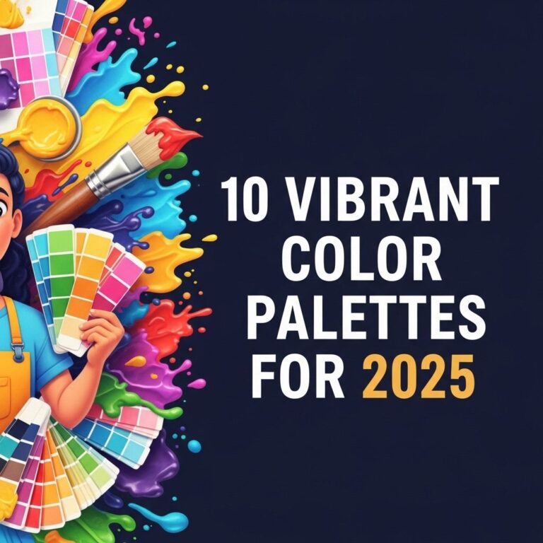
Color plays a pivotal role in design, influencing emotions and perceptions. Whether you’re working on a branding project, interior design, or digital art, the right color palette can enhance your work significantly. This article explores ten stunning color palette ideas that can inspire your next project, helping you create striking visuals that resonate with your audience.
Understanding Color Theory
Before diving into specific palettes, it’s vital to understand the basics of color theory. This theory explains how colors interact and how they can be combined to produce harmonious effects. Here are some fundamental concepts:
- Primary Colors: Red, blue, and yellow. These colors cannot be made by mixing other colors.
- Secondary Colors: Green, orange, and purple, formed by mixing primary colors.
- Tertiary Colors: These are colors made by mixing a primary color with a secondary color.
- Analogous Colors: Colors that are next to each other on the color wheel, creating a serene and comfortable design.
- Complementary Colors: Colors that are opposite each other on the color wheel, creating contrast and vibrancy.
Palette Ideas to Spark Creativity
1. Ocean Breeze
This palette evokes the calmness of the sea, making it perfect for wellness brands or spa-like environments. The colors include:
| Color | Hex Code |
|---|---|
| Deep Aqua | #007f7f |
| Seafoam Green | #2ee0bb |
| Soft Sand | #e9d8a6 |
| Coral Peach | #ff6b6b |
| Cloud White | #ffffff |
2. Autumn Reverie
This palette captures the warm hues of fall, ideal for cozy interiors or seasonal branding:
- Burnt Orange: #c65d3e
- Mustard Yellow: #d1b407
- Maple Red: #ab3e32
- Moss Green: #4a7c1c
- Harvest Beige: #e3b09a
3. Urban Chic
Perfect for modern businesses, the Urban Chic palette utilizes muted tones alongside bold accents:
- Charcoal Grey: #4b4b4b
- Slate Blue: #6b7c9a
- Bright Yellow: #f4d03f
- Coral: #ff6f61
4. Tropical Paradise
This vibrant palette is inspired by tropical landscapes and exotic flowers:
- Turquoise: #00bcd4
- Hot Pink: #ff4081
- Lime Green: #8bc34a
- Sunset Orange: #ff5722
5. Minimalist Monochrome
A monochromatic palette can create sleek and sophisticated designs. Consider these shades:
- Bright White: #ffffff
- Light Grey: #d3d3d3
- Dark Grey: #a9a9a9
- Jet Black: #000000
Tips for Choosing the Right Color Palette
Selecting a color palette involves more than just personal preference. Here are some tips to guide your choice:
- Understand Your Audience: Different colors evoke different feelings. Consider your target audience’s preferences.
- Test Combinations: Use design tools to visualize how colors work together before finalizing your palette.
- Stay Consistent: Ensure your palette aligns with your brand’s identity and message.
- Use Color Psychology: Different colors can influence moods and behaviors. Research the meanings behind colors.
6. Pastel Dream
This soft and soothing palette is ideal for designs that need a gentle touch:
| Color | Hex Code |
|---|---|
| Soft Pink | #f4c3c3 |
| Pale Blue | #add8e6 |
| Lavender | #e6e6fa |
| Mint Green | #b2f2c2 |
Conclusion
Choosing the right color palette is crucial for effective design. The options presented in this article provide a variety of styles and emotions, ensuring that you have a suitable palette for any project. Experiment with these combinations, keeping in mind the principles of color theory and the psychological effects of colors. The perfect palette is out there—waiting for you to discover it.
FAQ
What are some popular color palettes for home decor?
Some popular color palettes for home decor include neutral tones, monochromatic schemes, complementary colors, and nature-inspired palettes featuring greens and browns.
How can I choose a color palette for my brand?
To choose a color palette for your brand, consider your target audience, the emotions you want to evoke, and the overall message of your brand. Use tools like Adobe Color or Coolors to explore combinations.
What are the best color combinations for a wedding theme?
Some of the best color combinations for a wedding theme include blush and navy, emerald green and gold, and lavender and silver. Choose colors that reflect the season and your personal style.
How do I create a cohesive color palette for my website?
To create a cohesive color palette for your website, select a primary color, a secondary color, and a few accent colors that complement each other. Ensure they align with your branding and enhance user experience.
What colors work well together for a minimalist design?
For a minimalist design, stick to a monochromatic palette with shades of a single color or use a combination of black, white, and gray for a sleek, modern look.