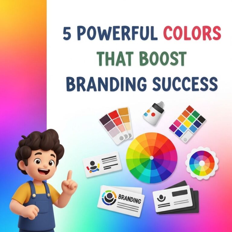
Color is a fundamental aspect of branding that can influence consumer perception, evoke emotions, and create memorable experiences. It plays a crucial role in how a brand is perceived in the market and can significantly impact its identity. In this article, we will explore ten powerful colors that can enhance brand identity, the psychological effects they have on consumers, and how businesses can effectively utilize them in their branding strategies.
The Psychology of Color
Before diving into specific colors, it’s essential to understand the psychology behind color choices. Colors can trigger emotional responses and associations that vary across different cultures. Here are some common emotional associations with various colors:
- Red: Excitement, passion, and energy
- Blue: Trust, reliability, and calmness
- Green: Growth, harmony, and freshness
- Yellow: Happiness, optimism, and warmth
- Purple: Luxury, creativity, and wisdom
- Orange: Enthusiasm, adventure, and friendliness
- Black: Sophistication, elegance, and power
- White: Purity, simplicity, and peace
- Brown: Stability, reliability, and comfort
- Pink: Love, compassion, and nurturing
1. Red
Red is a color that commands attention and invokes strong emotions. It is often used to stimulate appetite, which is why many fast-food brands incorporate it into their logos. Brands like Coca-Cola and Target use red to create excitement and energy.
Usage Tips
- Use sparingly in designs to convey urgency.
- Complement with neutral colors for balance.
- Consider the cultural context, as red can signify different meanings worldwide.
2. Blue
Blue is widely regarded as a calming color that exudes trust and professionalism. Many tech companies, such as IBM and Facebook, utilize blue to instill confidence in their users.
Usage Tips
- Pair with brighter colors for contrast.
- Use various shades to evoke different feelings (light blue for tranquility, dark blue for professionalism).
3. Green
Green is synonymous with nature, growth, and sustainability. Brands like Starbucks and Whole Foods capitalize on green to communicate their commitment to environmental responsibility.
Usage Tips
- Emphasize organic shapes and imagery to enhance the connection with nature.
- Incorporate different shades for versatility, from rich forest greens to fresh lime.
4. Yellow
Yellow is the color of sunshine and happiness. Its bright, cheerful nature makes it ideal for brands aiming to convey positivity. Brands like McDonald’s use yellow to create a friendly, inviting atmosphere.
Usage Tips
- Use as an accent color to grab attention without overwhelming.
- Avoid using too much yellow, as it can be straining on the eyes.
5. Purple
Purple conveys luxury and creativity, making it a favorite among high-end brands. Companies like Yahoo! and Hallmark utilize purple to evoke a sense of sophistication.
Usage Tips
- Combine with gold or silver for a luxurious feel.
- Use darker shades for more serious communications.
6. Orange
Orange is an energetic and fun color, often associated with adventure and enthusiasm. Brands like Fanta use orange to target younger audiences with its playful persona.
Usage Tips
- Use in call-to-action buttons to create urgency.
- Pair with contrasting colors for high visibility.
7. Black
Black is a timeless color that represents elegance and sophistication. Luxury brands like Chanel and Gucci frequently employ black in their branding to convey exclusivity.
Usage Tips
- Use in minimalist designs for a modern look.
- Combine with vibrant colors for striking contrasts.
8. White
White conveys simplicity and purity. It is often used in minimalist brands, such as Apple, to emphasize cleanliness and modernity.
Usage Tips
- Use white space effectively to create a sense of openness.
- Combine with bold colors for high impact.
9. Brown
Brown evokes feelings of warmth and stability. It is often used by brands that want to communicate reliability, like UPS and M&M’s.
Usage Tips
- Use earthy tones for a natural feel.
- Blend with other colors to create a balanced palette.
10. Pink
Pink is associated with love, compassion, and nurturing, making it popular among brands targeting a female audience. Brands like Victoria’s Secret effectively use pink to convey femininity.
Usage Tips
- Use in moderation to avoid stereotypes.
- Pair with other colors to broaden appeal.
Building a Cohesive Brand Identity
Choosing the right color for your brand is only one aspect of creating a cohesive brand identity. Here are some additional elements to consider:
| Element | Description |
|---|---|
| Logo | Your logo should incorporate your primary color while being adaptable for various backgrounds. |
| Typography | Choose fonts that complement your brand’s personality and align with your color choices. |
| Imagery | The images you use should reflect your brand values and resonate with your target audience. |
Conclusion
Color is a powerful tool in branding that can significantly affect consumer behavior and brand recognition. By understanding the psychological effects of colors and strategically implementing them in your brand’s identity, you can create a strong emotional connection with your audience. Experimenting with different shades, combinations, and applications can help refine your brand’s image and ensure that it resonates in the marketplace. Ultimately, a well-thought-out color strategy is essential for building a successful brand.
FAQ
What are the most effective colors for brand identity?
The most effective colors for brand identity include blue for trust, red for excitement, green for growth, yellow for optimism, purple for luxury, and black for sophistication.
How does color psychology influence brand perception?
Color psychology significantly influences brand perception by evoking emotions and associations that can enhance customer loyalty and recognition.
Can I use multiple colors in my brand identity?
Yes, using multiple colors can create a dynamic brand identity, but it’s essential to maintain a cohesive color palette that reflects your brand’s message.
What color combinations are best for branding?
Effective color combinations for branding include blue and yellow for energy, red and black for boldness, and green and brown for eco-friendliness.
How do I choose the right color for my brand?
To choose the right color for your brand, consider your target audience, industry trends, and the emotions you want to convey.