
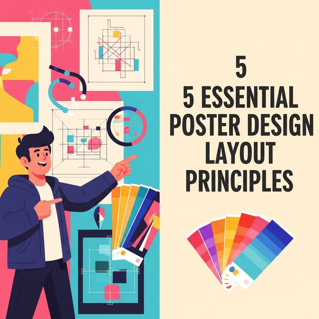
In the world of graphic design, creating an eye-catching poster is an art form that combines creativity with technical skills. Whether you are promoting an event, advertising a product, or conveying a message, the layout of your poster is crucial to its success. Understanding the principles of poster design layout can make a significant difference in how your audience perceives your message. This article explores five essential principles that every designer should consider when crafting their next poster.
1. Hierarchy of Information
The first step in designing an effective poster is establishing a clear hierarchy of information. This ensures that viewers can easily navigate the content and absorb the key messages. Here are some tips to achieve this:
- Use Size: Make the most important information larger. For instance, the event name or main message should be the focal point.
- Font Weight: Utilize bold fonts for headlines and lighter weights for additional details to create contrast.
- Color Variation: Highlight crucial information with color changes. A bright color for the main message, paired with a neutral background, can draw attention.
Example of Hierarchy in Action
Consider a music festival poster:
| Element | Font Size | Font Weight |
|---|---|---|
| Festival Name | 48px | Bold |
| Date & Time | 24px | Regular |
| Location | 20px | Italic |
2. Balance and Alignment
Creating visual balance within your poster is essential for guiding the viewer’s eye. It can be achieved through symmetrical or asymmetrical layouts:
- Symmetrical Layout: Both sides of the poster mirror each other, creating a sense of stability.
- Asymmetrical Layout: Different elements are arranged to create tension and interest, often leading the viewer’s eye to the focal point.
Key Points to Consider
When working on balance and alignment:
- Use grids to align elements consistently.
- Group related information together to form a cohesive block.
- Ensure that no side of the poster feels heavier than the other, unless intentionally designed for effect.
3. Color Theory
Colors evoke emotions and can significantly impact the viewer’s perception of your message. Understanding basic color theory is essential:
- Complementary Colors: Use colors that are opposite each other on the color wheel to create contrast and vibrancy.
- Analogous Colors: Colors next to each other create harmony and a pleasing visual experience.
- Monochromatic Schemes: Different shades of a single color can provide a clean, sophisticated look.
Practical Application
Choose a color palette based on the emotional tone you wish to convey:
| Emotion | Color Palette |
|---|---|
| Excitement | Red, Orange, Yellow |
| Trust | Blue, Green |
| Elegance | Black, Gold, White |
4. Typography Choices
The typeface you choose impacts not only the readability of your poster but also its overall aesthetic. Here’s how to make wise typography choices:
- Limit Font Families: Stick to two or three different fonts to maintain cohesion.
- Readability: Ensure the text is legible from a distance. Sans-serif fonts are frequently better for headlines.
- Contrast: Use contrasting colors for text and background to enhance readability.
Fonts for Different Purposes
Consider the type of event and choose fonts accordingly:
| Event Type | Recommended Fonts |
|---|---|
| Music Concert | Bold Display Fonts |
| Corporate Meeting | Professional Sans-serif Fonts |
| Art Exhibition | Creative Serif Fonts |
5. White Space Utilization
Also known as negative space, white space is the area around elements in your design. Effectively using white space can enhance your poster’s overall appearance:
- Improves Readability: Adequate spacing between text blocks makes reading easier.
- Draws Attention: White space can highlight important elements by creating breathing room around them.
- Creates Focus: Using white space strategically can lead the viewer’s eye to the main message.
Strategies for Effective White Space Use
To incorporate white space successfully:
- Use margins to frame your content.
- Group similar elements together with adequate spacing.
- Avoid clutter by leaving some areas of the poster intentionally blank.
Conclusion
Designing a captivating poster involves a blend of creativity, technical knowledge, and an understanding of key design principles. By applying hierarchy, balance, color theory, typography, and effective use of white space, you can create a poster that is not only visually appealing but also effectively communicates your message. Remember that every design choice should serve a purpose and contribute to the overall goal of your poster.
FAQ
What are the key principles of poster design layout?
The key principles of poster design layout include hierarchy, balance, contrast, alignment, and proximity.
How does hierarchy affect poster design?
Hierarchy in poster design guides the viewer’s eye to the most important information first, using size, color, and placement to create a visual flow.
Why is balance important in poster design?
Balance ensures that the elements of the poster are distributed evenly, creating a sense of stability and preventing visual clutter.
What role does contrast play in poster design?
Contrast enhances readability and draws attention to key elements by using differences in color, size, and shape.
How can alignment improve my poster layout?
Alignment organizes the design elements within a poster, creating a clean and cohesive look that enhances the overall aesthetic.
What is the significance of proximity in poster design?
Proximity groups related elements together, making the poster easier to understand and visually appealing by reducing clutter.
