
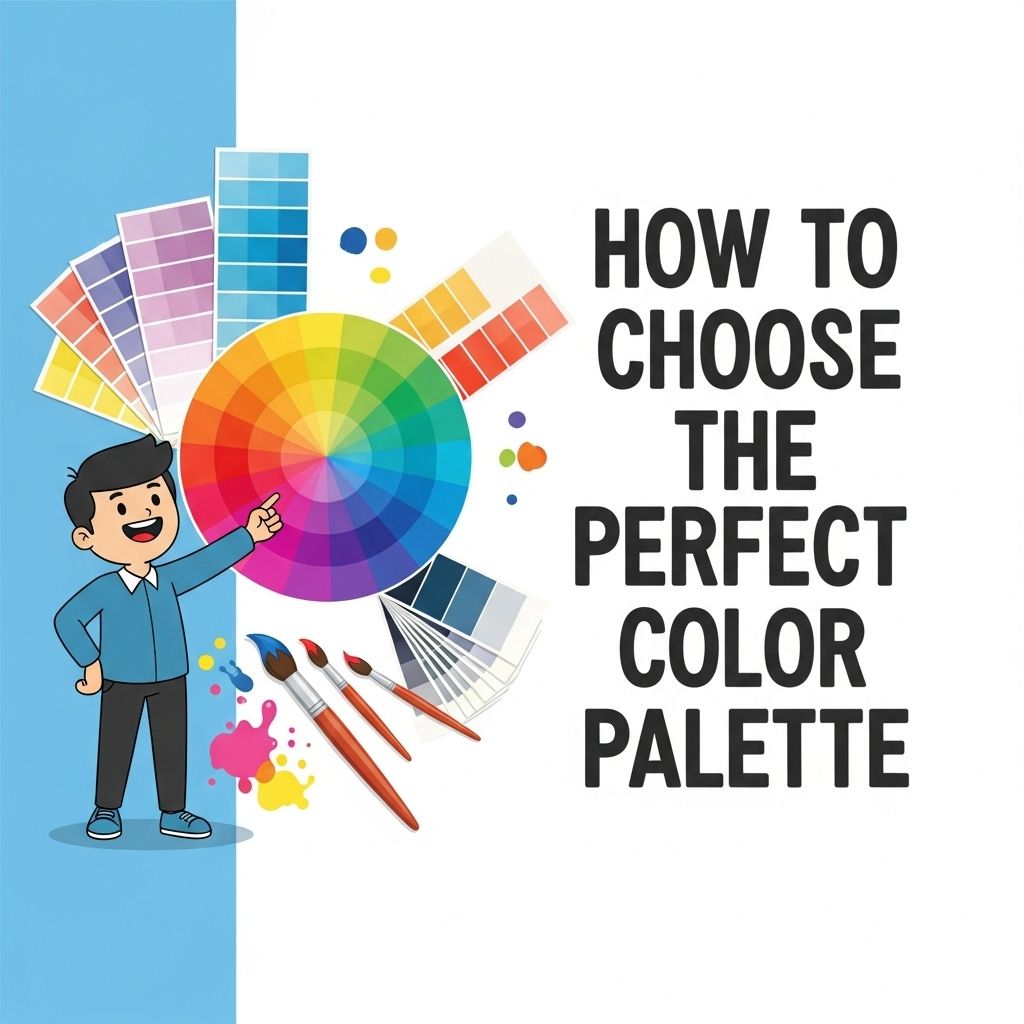
In a world where visual aesthetics play a significant role in user engagement and branding, choosing the right color palette is more important than ever. Whether you are designing a website, creating a logo, or developing an app, the colors you select can convey emotions, influence perceptions, and even drive user behavior. In this article, we will delve into the intricate process of selecting the perfect color palette, covering essential principles, tools, and best practices that will help elevate your designs.
Understanding Color Theory
Before diving into practical steps for selecting a color palette, it’s crucial to have a grasp of some fundamental concepts in color theory. Color theory encompasses the science and art of using color. Here are some key components:
The Color Wheel
The color wheel is a circular diagram of colors arranged according to their relationships. It consists of:
- Primary Colors: Red, blue, yellow. These colors cannot be created by mixing other colors.
- Secondary Colors: Green, orange, purple. These are formed by mixing primary colors.
- Tertiary Colors: These result from mixing primary and secondary colors.
Color Harmonies
Color harmonies are established combinations of colors that are pleasing to the eye. Here are a few popular harmonies:
- Complementary: Colors opposite each other on the color wheel (e.g., red and green).
- Analogous: Colors next to each other (e.g., blue, blue-green, and green).
- Triadic: Three colors evenly spaced around the wheel (e.g., red, yellow, and blue).
Defining Your Brand Identity
Before selecting colors, it’s essential to define your brand identity. Your color choices should align with your brand’s personality and values. Consider the following aspects:
Target Audience
Understanding your target demographic can significantly influence color choices. Different colors evoke different emotions and perceptions:
| Color | Emotion/Association |
|---|---|
| Red | Passion, energy, urgency |
| Blue | Trust, calm, professionalism |
| Green | Health, growth, tranquility |
| Yellow | Optimism, warmth, creativity |
| Purple | Luxury, mystery, spirituality |
Brand Values
Your values should guide your color choices. For instance:
- Sustainability: Earthy tones like greens and browns.
- Innovation: Bright, vivid colors to signify creativity.
- Luxury: Deep, rich colors like gold and royal purple.
Practical Steps to Create a Color Palette
Now that you have a foundational understanding of color theory and brand identity, here’s a step-by-step guide to creating your color palette:
Step 1: Choose Your Base Color
Your base color is the dominant hue in your palette. This color should reflect your brand’s personality and values. Use color psychology to help select a base color that resonates with your audience.
Step 2: Create Variations
Once you have your base color, create variations by adjusting the hue, saturation, and brightness. This will allow you to develop a range of colors that can be used in different contexts:
- Tints: Add white to create lighter versions.
- Shades: Add black for darker versions.
- Tones: Add gray for muted versions.
Step 3: Add Complementary Colors
Integrate complementary colors to create contrast and make certain elements pop. This can guide users’ attention to critical areas, such as call-to-action buttons.
Step 4: Incorporate Neutrals
Neutral colors (whites, blacks, grays, and browns) can help balance vibrant colors and provide visual relief. They can also serve as backgrounds, allowing your primary colors to stand out.
Step 5: Test Your Palette
Testing your color palette in various contexts is crucial. Consider how it appears on different devices, against various backgrounds, and in different lighting conditions. Here are some suggestions for testing:
- Use mock-ups to visualize your design.
- Gather feedback from users to understand their perceptions.
- Check for accessibility to ensure readability for all users.
Tools for Color Palette Generation
Several online tools can help streamline the process of creating and visualizing color palettes:
- Adobe Color: A user-friendly tool for creating color schemes and exploring harmonies.
- Coolors: A color scheme generator that allows you to create palettes quickly.
- Canva: Offers a color palette generator based on uploaded images.
- Color Hunt: Provides a curated collection of color palettes.
Final Thoughts
The right color palette can significantly enhance your design’s appeal and effectiveness. By understanding color theory, defining your brand identity, and utilizing tools and practices discussed in this article, you can create a well-thought-out color scheme that aligns with your brand and resonates with your audience. Remember, colors are not just aesthetic choices; they are powerful communicators of your brand’s message.
FAQ
What factors should I consider when choosing a color palette?
When selecting a color palette, consider the mood you want to convey, the target audience, and the context in which the colors will be used. Additionally, think about color theory principles such as complementary and analogous colors.
How can I create a harmonious color palette?
To create a harmonious color palette, use a color wheel to identify colors that complement or contrast well with each other. Limit your palette to a few main colors with varying shades and tones to maintain cohesion.
What tools can I use to choose a color palette?
There are several online tools available for selecting color palettes, such as Adobe Color, Coolors, and Canva’s Color Palette Generator. These tools allow you to experiment with different combinations and visualize your choices.
Should I consider current design trends when choosing a color palette?
Yes, while it’s important to choose colors that resonate with your brand, being aware of current design trends can help keep your palette fresh and relevant. However, ensure that your choices align with your brand identity.
How can I test my color palette before finalizing it?
You can test your color palette by applying it to mockups or prototypes of your design. Gather feedback from others and observe how the colors look in different lighting conditions and on various screens.
