In the ever-evolving world of design, minimalist logos continue to stand out for their simplicity and effectiveness. As we step into 2025, the principles of minimalist logo design remain relevant, offering brands an opportunity to communicate their essence with clarity and elegance. This article will delve into the best practices for creating minimalist logos, explore the latest trends, and provide practical tips for designers looking to craft impactful visual identities.
The Essence of Minimalist Design
Minimalism in graphic design emphasizes simplicity and functionality. A minimalist logo strips away unnecessary elements, focusing instead on the core message. Here are some key characteristics of minimalist designs:
- Clarity: Every element has a purpose.
- Limited Color Palette: Usually employing two to three colors.
- Simplicity: Clean lines and shapes dominate the visual.
- Timelessness: Minimalist logos tend to age well.
Understanding the Market Trends for 2025
As we move into 2025, several trends are shaping the design landscape. Staying informed about these trends will help designers create relevant and effective logos.
Current Trends Influencing Minimalist Logos
- Natural Colors: Earthy tones are gaining popularity, moving away from vibrant hues to soft, muted palettes.
- Geometric Shapes: Simple geometric figures are being used to create memorable logos.
- Typography Focus: Custom typefaces that complement the logo design are becoming more important.
- Responsive Design: Logos that work seamlessly across various devices and platforms are crucial.
Steps to Create a Minimalist Logo
Creating a minimalist logo involves a structured approach. Here’s a step-by-step guide to help you through the process:
1. Research and Gather Inspiration
Start by understanding the brand’s core values, target audience, and competitors. Look for inspiration through:
- Design platforms like Behance and Dribbble
- Social media, particularly Pinterest and Instagram
- Logo design books and case studies
2. Define the Brand Identity
Clarify what the brand stands for. Consider using a brand brief that answers the following:
| Question | Explanation |
|---|---|
| What are the brand values? | The principles that guide your brand’s actions. |
| Who is the target audience? | Demographics and psychographics of potential customers. |
| What differentiates the brand? | Unique selling points that set the brand apart. |
3. Brainstorm and Sketch Concepts
Before heading into digital design, sketch out ideas on paper. Focus on:
- Simple shapes that represent the brand.
- Initials or monograms that can be stylized.
- Symbolic elements that resonate with the brand identity.
4. Choose the Right Colors
Limit your color palette to ensure that your logo remains versatile. Consider the psychology of colors:
- Blue: Trust and dependability
- Green: Growth and sustainability
- Black: Elegance and sophistication
- Red: Passion and energy
5. Select Typography
Choose fonts that complement the logo design. When it comes to minimalist logos, consider:
- Sans-serif fonts for a modern feel.
- Custom typography for uniqueness.
- Legibility as a top priority, especially at smaller sizes.
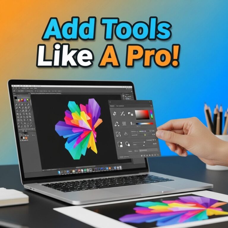
6. Digitalize Your Design
Using vector software like Adobe Illustrator, create digital versions of your sketches. Ensure that:
- Lines are clean and shapes are well-defined.
- The logo is scalable for different applications.
- Export in multiple formats (SVG, PNG, etc.) for versatility.
7. Seek Feedback and Refine
Once you have a few digital versions, seek feedback from clients, peers, or target audience members. This can provide valuable insights into the effectiveness of your design.
8. Finalize and Deploy
After incorporating feedback, finalize your logo. Consider how it will be used across different media:
- Business cards
- Websites
- Social media
- Print materials
Case Studies of Successful Minimalist Logos
Analyzing successful minimalist logos can provide insight into effective design strategies. Here are two notable examples:
1. Apple
Apple’s logo—a simple apple with a bite taken out—demonstrates that a minimalist logo can be iconic. It is versatile, instantly recognizable, and conveys innovation.
2. Nike
The Nike swoosh is another prime example of effective minimalist design. It represents motion and speed, aligning perfectly with the brand’s identity in sports and fitness.
Common Pitfalls to Avoid
While designing minimalist logos, it’s easy to fall into certain traps. Keep the following pitfalls in mind:
- Overcomplication: Adding elements that dilute the message.
- Ignoring Scalability: Designs that don’t work at smaller sizes.
- Not Testing in Context: Failing to see how the logo looks in real-world applications.
Conclusion
As we look forward to 2025, the importance of creating minimalist logos will continue to grow. They offer brands a way to convey their identity with clarity and sophistication. By following the steps outlined in this article and staying attuned to design trends, designers can create timeless logos that resonate with audiences for years to come. Embrace the simplicity and power of minimalist design to elevate your brand’s visual identity.
FAQ
What are the key principles of minimalist logo design?
The key principles of minimalist logo design include simplicity, clarity, and the effective use of negative space to convey the brand message without unnecessary elements.
What tools can I use to create minimalist logos in 2025?
In 2025, popular tools for creating minimalist logos include Adobe Illustrator, Canva, and online logo makers like Looka and LogoMaker, which offer user-friendly interfaces and templates.
How can I ensure my minimalist logo stands out?
To ensure your minimalist logo stands out, focus on unique shapes, a limited color palette, and a strong typography choice that reflects your brand identity.
What are the benefits of using a minimalist logo for my brand?
The benefits of using a minimalist logo include easier recognition, versatility across various platforms, and a timeless appeal that avoids trends.
How do I choose the right colors for my minimalist logo?
Choosing the right colors for your minimalist logo involves understanding color psychology, selecting a limited palette that resonates with your brand values, and ensuring high contrast for visibility.
Can I create a minimalist logo without graphic design experience?
Yes, you can create a minimalist logo without graphic design experience by using online logo design tools that provide templates and customization options tailored for beginners.