In today’s data-driven world, the ability to visualize information effectively is crucial for making informed decisions. Whether you are a data analyst, a business professional, or simply someone interested in data, leveraging data visualization software can significantly enhance your understanding of complex datasets. Fortunately, there are several free tools available that can help you transform raw data into insightful visual narratives. This article delves into various free data visualization software options, their features, and best practices for utilizing them effectively.
Understanding Data Visualization
Data visualization is the graphical representation of information and data. By using visual elements like charts, graphs, and maps, data visualization tools provide an accessible way to see and understand trends, outliers, and patterns in data. The importance of data visualization lies in its ability to:
- Convert complex data sets into visual insights.
- Enhance data comprehension and accessibility.
- Facilitate quicker decision-making.
- Support storytelling with data.
Choosing the Right Free Data Visualization Software
Many free data visualization tools are available, each with unique features, strengths, and weaknesses. Selecting the right one can depend on your specific needs, such as the type of data you are working with, your level of expertise, and the complexity of the visualizations you want to create. Below are some popular free options:
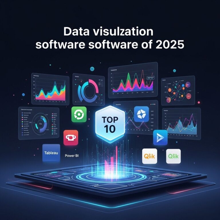
1. Tableau Public
Tableau Public is a widely used data visualization tool that allows users to create interactive and shareable dashboards. Its drag-and-drop interface makes it user-friendly.
- Pros: Powerful visualization capabilities, strong community support, and easy sharing options.
- Cons: Some features are limited in the free version, and all visualizations are publicly accessible.
2. Google Data Studio
Google Data Studio is another excellent free tool that integrates seamlessly with other Google services, such as Google Sheets and Google Analytics.
- Pros: User-friendly interface, real-time collaboration, and interactive dashboards.
- Cons: Limited to Google ecosystem; some complex visualizations may require additional learning.
3. Microsoft Power BI Desktop
While Power BI has paid versions, the desktop version is free and offers robust reporting and visualization features.
- Pros: Extensive interactive visualization options and integration with Microsoft products.
- Cons: Requires installation on a Windows machine, and sharing capabilities are limited in the free version.
4. Chart.js
Chart.js is a JavaScript library that allows developers to create responsive and beautiful charts using HTML5 canvas.
- Pros: Highly customizable, open-source, and lightweight.
- Cons: Requires coding knowledge; less support for non-developers.
Best Practices for Effective Data Visualization
Once you’ve selected your data visualization software, utilizing it effectively requires an understanding of best practices. Here are some key strategies to ensure that your visualizations are impactful:
1. Know Your Audience
Understanding who will be viewing your visualizations is crucial. Tailor your designs and complexity based on their level of expertise.
2. Simplify Your Data
Avoid cluttering your visuals with too much information. Focus on key messages and data points to ensure clarity.
3. Choose the Right Chart Type
Different types of data require different visualizations. Here’s a guide to common chart types:
| Chart Type | Best Use |
|---|---|
| Bar Chart | Comparing quantities across categories. |
| Line Chart | Showing trends over time. |
| Pie Chart | Representing proportions of a whole. |
| Scatter Plot | Visualizing relationships between two variables. |
4. Use Color Wisely
Colors can enhance your visualizations but can also confuse if used excessively. Stick to a consistent color palette and ensure adequate contrast between elements.
5. Test and Iterate
Gather feedback from peers and test your visualizations with real users. Iteration based on this feedback can significantly improve the effectiveness of your visualizations.
Sharing and Collaboration
Once your data visualizations are complete, sharing them with stakeholders is essential. Most free tools offer cloud-based options for easy sharing. Here are some ways to share:
- Publishing to the web for public access.
- Embedding visualizations in websites or presentations.
- Exporting to PDF or image formats for offline sharing.
Conclusion
Data visualization is an invaluable skill in the modern world, and utilizing free software effectively can elevate your ability to present and communicate insights from data. By choosing the right tools, adhering to best practices, and remaining open to feedback, you can create compelling visual narratives that resonate with your audience. Start experimenting with the tools mentioned above, and watch your data transform into meaningful insights!
FAQ
What is data visualization software?
Data visualization software helps users represent data graphically, making complex data more accessible and understandable through charts, graphs, and maps.
How can I use free data visualization software effectively?
To use free data visualization software effectively, start by defining your objectives, choose the right tool, familiarize yourself with its features, and focus on clear and concise visuals.
What are some popular free data visualization tools?
Popular free data visualization tools include Tableau Public, Google Data Studio, and Microsoft Power BI Desktop, which offer a range of features for creating interactive visualizations.
Can I create interactive dashboards with free data visualization software?
Yes, many free data visualization tools allow you to create interactive dashboards that enable users to explore data more deeply.
What are best practices for designing effective data visualizations?
Best practices for designing effective data visualizations include using appropriate chart types, maintaining simplicity, ensuring clarity, and using color effectively to highlight key insights.
Is it possible to collaborate with others using free data visualization software?
Yes, many free data visualization platforms offer collaboration features that allow users to share their visualizations and work together in real-time.