As businesses and individuals strive to establish their identities in a visually-driven world, the creation of effective logos becomes paramount. Text logos, in particular, can be a powerful way to communicate brand values and messages succinctly. Midjourney, a popular tool in the graphic design arsenal, offers unique capabilities for crafting text-based logos that resonate. Below are some essential tips for leveraging Midjourney to create impactful text logos.
Understanding Text Logos
Text logos primarily use typography to convey a brand’s identity. Unlike symbol-based logos, text logos emphasize the power of words in branding. Key characteristics of effective text logos include:
- Clarity: The text should be easy to read and recognize.
- Distinctiveness: A unique font or style helps a logo stand out.
- Relevance: The design should reflect the brand’s personality.
Tip 1: Choose the Right Font
The font is the backbone of any text logo. It sets the tone and can evoke different emotions. Here are some considerations when selecting a font:
Types of Fonts
- Serif Fonts: Traditional and trustworthy (e.g., Times New Roman, Georgia).
- Sans-Serif Fonts: Modern and clean (e.g., Arial, Helvetica).
- Script Fonts: Elegant and personal (e.g., Pacifico, Great Vibes).
- Display Fonts: Unique and stylized (e.g., Bebas Neue, Impact).
Tips for Font Selection
- Consider your target audience and industry.
- Avoid overly complex fonts that hinder readability.
- Test different fonts in various sizes to ensure versatility.
Tip 2: Embrace Color Theory
Colors play a significant role in branding, impacting how a logo is perceived. Understanding color theory can enhance your text logo’s effectiveness.
Color Psychology
| Color | Emotion/Message |
|---|---|
| Red | Passion, energy, urgency |
| Blue | Trust, calm, professionalism |
| Green | Growth, nature, health |
| Yellow | Optimism, creativity, warmth |
| Purple | Luxury, spirituality, wisdom |
Color Combination Tips
- Limit your palette to two or three colors for simplicity.
- Use contrasting colors to enhance readability.
- Consider the emotions you want to evoke with your color choices.
Tip 3: Balance Simplicity and Creativity
While creativity is essential, simplicity often leads to better recognition. A cluttered logo can confuse viewers and dilute brand identity.
Achieving Balance
- Focus on one or two key elements rather than overcrowding with graphics.
- Ensure the design can be scaled down without losing impact.
- Test the logo in black and white to check if the design holds up without color.
Examples of Effective Simple Text Logos
- Nike: The bold, simple font conveys strength.
- Coca-Cola: The iconic script font is instantly recognizable.
- Google: Clean sans-serif font promotes clarity and modernity.
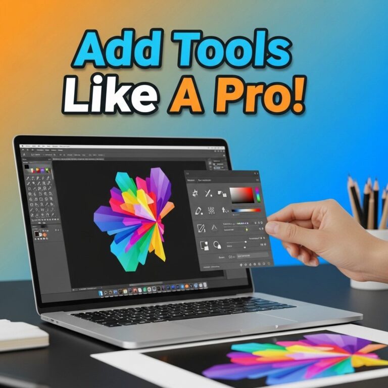
Tip 4: Utilize Midjourney Features
Midjourney is equipped with various features that can enhance your logo design process. Knowing how to harness these tools can save time and improve the final product.
Key Features
- Custom Prompts: Tailor your design requests to generate unique logo ideas.
- Styles and Filters: Apply different styles to see how they change your text’s appearance.
- Variations: Generate multiple logo variations with just a few clicks.
Maximizing Use of Midjourney
- Experiment with different prompts to explore diverse outcomes.
- Save your favorite designs for further refinement.
- Engage with the Midjourney community for inspiration and feedback.
Tip 5: Test and Iterate
Once you have a draft of your logo, it’s crucial to test its effectiveness. Feedback can provide insights that you may not have considered.
Testing Your Logo
- Conduct surveys among target demographics to gauge reactions.
- Check how the logo looks in various formats (e.g., web, print).
- Seek critique from design professionals for expert opinions.
Iterate Based on Feedback
- Make necessary adjustments based on user feedback.
- Refine your color scheme, font choice, or layout as required.
- Ensure your final design aligns with your brand’s core values and messaging.
Conclusion
Designing a text logo is both an art and a science. By understanding the fundamental principles of typography, color, and simplicity, and utilizing tools like Midjourney effectively, you can create a logo that captures attention and communicates your brand effectively. Remember to test your designs and make iterative improvements based on feedback to achieve the best results. With these essential tips, you’re well on your way to creating an impactful text logo that leaves a lasting impression.
FAQ
What are the best practices for creating midjourney text logos?
To create effective midjourney text logos, focus on simplicity, choose a suitable font, ensure readability, incorporate brand colors, and maintain scalability for different sizes.
How can I make my midjourney text logo stand out?
Use unique typography, experiment with text effects, integrate relevant icons, and consider using a distinctive color palette to make your midjourney text logo memorable.
What software can I use to design midjourney text logos?
Popular software for designing midjourney text logos includes Adobe Illustrator, Canva, and Inkscape, all of which offer tools for creating and customizing text-based designs.
Are there any common mistakes to avoid when designing midjourney text logos?
Yes, avoid using overly complex fonts, neglecting to test readability at different sizes, and failing to align with your brand identity, as these can detract from your logo’s effectiveness.
How can color choice impact my midjourney text logo?
Color choice plays a crucial role in conveying your brand message, evoking emotions, and ensuring visibility. Selecting colors that complement your brand can enhance recognition and impact.