
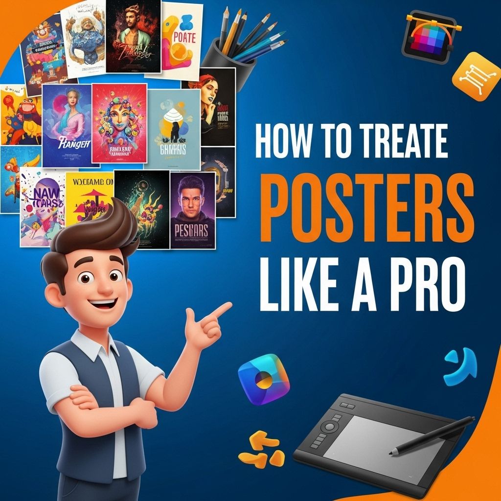
Creating posters can be a fulfilling and exciting endeavor, whether for personal use, events, or promotions. A well-designed poster not only captures attention but also conveys messages effectively. In today’s digital age, there are various tools and techniques available that allow anyone to create stunning posters with ease. This article will guide you through the essential steps and best practices to help you craft posters like a professional.
Understanding the Basics of Poster Design
Before delving into the specifics of creating posters, it’s important to understand the fundamental principles of design that will elevate your work.
Key Elements of Design
- Color: Choose a color palette that reflects the theme and enhances readability.
- Typography: Use fonts that are legible from a distance, and maintain a hierarchy in text sizes.
- Imagery: Incorporate high-quality images or graphics that resonate with your message.
- Space: Utilize negative space effectively to avoid clutter and improve focus.
Choosing the Right Tools
There are several software options available for poster design, ranging from simple to advanced. Here are some popular choices:
Graphic Design Software
- Adobe Illustrator: Industry-standard vector graphics editor ideal for intricate designs.
- Canva: User-friendly online platform with templates for quick designs.
- GIMP: Free and open-source alternative to Photoshop for editing images.
- Microsoft PowerPoint: Surprisingly effective for basic poster designs, especially for beginners.
Defining Your Purpose and Audience
Understanding the purpose of your poster is crucial. Ask yourself:
- What message do I want to convey?
- Who is my target audience?
- What action do I want viewers to take after seeing the poster?
Defining these aspects can significantly influence your design choices.
Crafting Your Message
Once you’ve established the purpose and audience, it’s important to craft a clear and concise message. Here are some tips:
Writing Effective Copy
- Use a catchy headline to grab attention.
- Keep the text minimal; focus on key points.
- Incorporate a call to action (CTA) that encourages engagement.
Utilizing Visual Hierarchy
Visual hierarchy guides the viewer’s eye through the poster. Consider:
| Element | Effect |
|---|---|
| Size | Larger elements draw more attention. |
| Color | High contrast colors can highlight important information. |
| Alignment | Properly aligned elements create balance. |
Design Tips for Maximum Impact
When designing your poster, keep the following tips in mind:
1. Keep it Simple
A cluttered poster can confuse the viewer. Strive for simplicity in design and message.
2. Use High-Quality Images
Ensure any images or graphics are high resolution to avoid pixelation when printed.
3. Maintain Brand Consistency
If you’re designing for a brand, incorporate their colors, fonts, and logos to maintain consistency across materials.
4. Test Readability
Print a draft and check if the text is readable from a distance.
Printing Your Poster
The medium you choose for printing can greatly affect the final outcome. Consider the following:
Types of Paper
- Glossy: Great for vibrant colors but can create glare.
- Matte: Less glare, provides a sophisticated look.
- Recycled: Eco-friendly option contributing to sustainable practices.
Print Resolution
Ensure your file is at least 300 DPI (dots per inch) for optimal print quality.
Distributing Your Poster
After printing, the next step is distribution. Here are some effective strategies:
Online Sharing
Share your poster on social media platforms, community boards, and email newsletters to reach a wider audience.
Physical Locations
Post your designs in high-traffic areas related to your target audience, such as:
- Community centers
- Cafes
- Universities
- Event venues
Feedback and Iteration
Once your poster is out in the world, gather feedback from viewers. Analyze what worked and what could be improved for future designs. Tools like surveys or direct interviews can offer insights into audience reception.
Conclusion
Creating posters like a pro involves a combination of understanding design principles, utilizing the right tools, and having a clear message. By following the outlined steps and continuously practicing your skills, you can enhance your poster design abilities and make a significant impact with your creations. So whether it’s for an event, a campaign, or personal use, take these tips to heart and let your creativity shine through your posters.
FAQ
What software is best for creating professional posters?
Some of the best software for creating professional posters include Adobe Illustrator, Photoshop, Canva, and CorelDRAW.
What are the essential elements of a great poster design?
Essential elements of a great poster design include a catchy headline, engaging visuals, clear typography, and a well-defined color scheme.
How do I choose the right size for my poster?
Choosing the right size for your poster depends on where it will be displayed; common sizes include 24×36 inches for large posters and 11×17 inches for smaller ones.
What tips can help me make my poster more visually appealing?
To make your poster more visually appealing, use high-quality images, maintain a balance between text and visuals, and utilize white space effectively.
How can I ensure my poster communicates the intended message?
To ensure your poster communicates the intended message, keep the text concise, use a clear hierarchy of information, and align visuals with the message.
Is it important to consider color psychology in poster design?
Yes, considering color psychology is important in poster design as different colors evoke different emotions and can influence the viewer’s perception.
