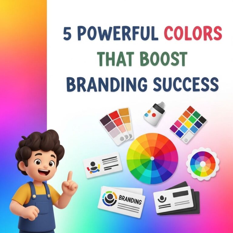
Color is more than just a visual element; it’s an essential aspect of branding that can profoundly influence consumer perceptions and behavior. The right color strategy can differentiate your brand in a crowded marketplace, evoke emotions, and foster loyalty. In this article, we will explore five effective color strategies that can transform your branding efforts and help you stand out.
Understanding Color Psychology
Before delving into specific strategies, it is crucial to understand color psychology—the study of how colors affect perceptions and behaviors. Each color can evoke different feelings and associations. Here are some common colors and their psychological impacts:
| Color | Emotion/Association |
|---|---|
| Red | Passion, urgency, excitement |
| Blue | Trust, calm, professionalism |
| Green | Growth, health, tranquility |
| Yellow | Optimism, clarity, warmth |
| Purple | Luxury, creativity, wisdom |
| Black | Elegance, sophistication, formality |
| Orange | Playfulness, enthusiasm, adventure |
| Pink | Compassion, love, femininity |
1. Create a Color Palette that Reflects Your Brand Identity
Your color palette should encapsulate your brand’s identity and values. Start by defining your brand’s mission, vision, and target audience. Here are steps to craft an effective color palette:
- Research Your Audience: Understand the demographics of your target audience, including age, gender, and preferences.
- Conduct Competitive Analysis: Analyze competitors to identify color trends in your industry, ensuring your palette stands out.
- Select Primary and Secondary Colors: Choose 1-3 primary colors that represent your brand and 2-4 secondary colors for versatility.
- Test Your Palette: Create mock-ups to see how your colors work together in various contexts, such as logos, websites, and packaging.
2. Leverage Color Contrast for Readability
Color contrast is vital for ensuring readability and user engagement on digital platforms. High contrast between text and background enhances legibility and draws attention to key messages. Consider the following:
- Use Dark Text on Light Backgrounds: This classic combination is easy to read and visually appealing.
- Avoid Color Conflicts: Ensure that colors do not clash, which can distract readers.
- Utilize Color Blind Accessibility: Incorporate patterns or textures to support users with color blindness.
Tools for Analyzing Color Contrast
Utilize online tools to analyze color contrast, such as:
3. Consistency Across All Platforms
Consistency in color usage across various touchpoints reinforces brand identity. Here’s how to maintain consistency:
- Create Brand Guidelines: Document your chosen color palette, usage rules, and examples of application.
- Use Design Tools: Tools like Adobe Color or Coolors can help you carry your color palette consistently across designs.
- Limit Color Variations: Use your primary colors predominantly and reserve secondary colors for accents.
Branding Touchpoints
Ensure your color consistency across the following touchpoints:
- Website
- Social Media Profiles
- Packaging
- Email Marketing
- Promotional Materials
4. Utilize Color Trends to Stay Relevant
Staying updated with color trends can make your brand feel current and relevant. Each year, various organizations like Pantone release their color of the year. Here are ways to incorporate trends:
- Research Annual Color Reports: Follow industry leaders and design publications to identify upcoming trends.
- Incorporate Trending Colors in Marketing Campaigns: Use trending colors in seasonal campaigns or special promotions to grab attention.
- Adapt Without Overhauling: Integrate trendy colors subtly rather than completely changing your brand colors.
Examples of Color Trends
Consider recent trends such as:
- Warm Earth Tones
- Soft Pastels
- Bold Jewel Tones
5. Test and Iterate Based on Feedback
Finally, testing your color choices through user feedback is essential to ensure your strategy resonates with your audience. Implement these strategies:
- Conduct A/B Testing: Test different color schemes on websites or advertisements to gauge engagement and conversion rates.
- Gather Audience Feedback: Use surveys to collect opinions on color preferences.
- Adjust Based on Performance: Analyze the data and make necessary adjustments to optimize your color strategy.
Conclusion
Color strategies play a vital role in branding, impacting how consumers perceive and engage with your brand. By understanding color psychology, creating a cohesive palette, ensuring readability, maintaining consistency, staying updated on trends, and testing your choices, you can effectively leverage color to boost your brand’s visibility and connection with your audience. Careful implementation of these strategies will help create a lasting impression and foster brand loyalty.
FAQ
What are color strategies in branding?
Color strategies in branding involve selecting specific colors that align with your brand’s identity and values to evoke certain emotions and perceptions among consumers.
How can I choose the right colors for my brand?
To choose the right colors for your brand, consider your target audience, the emotions you want to evoke, and the message you wish to convey. Conducting market research can also help you understand color preferences in your industry.
What emotions do different colors evoke in consumers?
Different colors evoke various emotions; for example, blue often conveys trust and reliability, red can evoke excitement and urgency, while green is associated with health and tranquility.
Can color strategies impact brand recognition?
Yes, effective color strategies can significantly enhance brand recognition. Consistent color usage helps consumers identify and remember your brand more easily.
How do I implement a color strategy across my marketing materials?
To implement a color strategy, ensure consistent use of your chosen colors across all marketing materials, including your website, social media, packaging, and advertising, to create a cohesive brand image.
Is it necessary to follow color psychology in branding?
While it’s not mandatory, following color psychology can be beneficial as it allows you to leverage the emotional responses associated with colors to strengthen your brand’s connection with consumers.