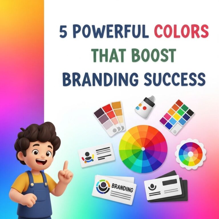
Color is more than just an aesthetic choice; it plays a crucial role in branding and marketing strategies. The psychology behind color can significantly influence consumer behavior, perceptions, and emotions. By understanding the impact of different colors, brands can effectively communicate their message and connect with their audience on a deeper level. This article delves into the fundamentals of color psychology and provides seven powerful tips for leveraging color in branding efforts.
The Basics of Color Psychology
At its core, color psychology is the study of how colors affect human behavior and emotions. Colors can evoke feelings, convey messages, and even influence decisions. Here are some basic insights into common colors and their associated meanings:
| Color | Emotions & Meanings |
|---|---|
| Red | Passion, energy, urgency |
| Blue | Trust, calmness, professionalism |
| Green | Growth, health, tranquility |
| Yellow | Happiness, optimism, attention-grabbing |
| Purple | Luxury, creativity, wisdom |
| Black | Elegance, power, sophistication |
| White | Purity, simplicity, clarity |
Establishing Brand Identity Through Color
Your brand identity is the perception consumers have about your business, and color plays a vital role in shaping that perception. Here are seven tips on how to use color effectively in your branding:
1. Understand Your Target Audience
Different demographics may respond differently to colors. For example, younger audiences may be attracted to vibrant and bold colors, while older demographics might prefer more subdued tones. Understanding your target audience is crucial in selecting the right color palette.
2. Develop a Color Palette
Creating a cohesive color palette is essential for brand recognition. Consider limiting your primary color choices to three to five colors that work well together. Ensure that these colors reflect the key attributes of your brand.
3. Evoke the Right Emotions
Think about the emotions you want your brand to evoke. Here’s how to leverage specific colors to convey certain feelings:
- Red: Ideal for brands aiming to create a sense of urgency.
- Blue: Perfect for brands that want to instill trust and dependability.
- Green: Suited for brands focused on sustainability and health.
- Yellow: Great for brands looking to spark joy and happiness.
4. Ensure Accessibility
It’s essential that your color choices are accessible to all users, including those with visual impairments. Use tools like contrast checkers to ensure that your text is easily readable against your background colors. Aim for a contrast ratio that meets accessibility standards.
5. Test and Iterate
Color preferences can be subjective, so it’s vital to test your color palette with real users. Conduct A/B testing on various platforms to see how different colors perform in terms of engagement and conversion rates. Be prepared to iterate based on the feedback you receive.
6. Create Visual Hierarchy
Utilize color to establish a visual hierarchy in your branding materials. Use contrasting colors to differentiate between various elements, such as calls-to-action, headers, and body text. This helps guide the viewer’s eye and enhances the overall user experience.
7. Stay Consistent Across Channels
Consistency is key to building a strong brand. Ensure that the colors used in your logo, website, packaging, and social media are uniform. This consistency reinforces brand recognition and helps create a cohesive brand identity across all platforms.
Real-World Examples of Effective Color Use
Many successful brands have mastered the art of color psychology. Here are a few notable examples:
- Coca-Cola: The bold red color evokes excitement and passion, aligning perfectly with the brand’s energy.
- Facebook: The blue color instills a sense of trust and calmness, which is essential for a social platform.
- Starbucks: The green color symbolizes growth and tranquility, resonating well with the brand’s coffeehouse atmosphere.
Conclusion
Understanding color psychology is a powerful asset for any brand looking to establish a strong identity and connect with its audience. By leveraging colors thoughtfully, brands can evoke the desired emotions, improve user experience, and ultimately drive engagement and sales. Whether starting from scratch or looking to revamp your current branding, keep these color psychology tips in mind to create a memorable brand experience.
FAQ
What is color psychology in branding?
Color psychology in branding refers to the study of how colors influence perceptions, feelings, and behaviors towards a brand. It helps businesses choose colors that align with their brand identity and connect with their target audience.
How do colors affect consumer behavior?
Colors can evoke emotions and trigger specific responses in consumers. For instance, blue may instill trust, while red can create a sense of urgency. Understanding these associations can help brands influence purchasing decisions.
What are some effective color combinations for branding?
Effective color combinations depend on the brand’s message and target audience. Popular combinations include blue and white for professionalism, or yellow and black for energy and attention. It’s essential to choose colors that complement each other and convey the desired brand image.
How can I choose the right color for my brand?
To choose the right color for your brand, consider your target audience, the emotions you want to evoke, and the values you want to communicate. Conducting market research and testing different color palettes can also provide valuable insights.
Does color choice impact brand recognition?
Yes, color choice significantly impacts brand recognition. Consistent use of specific colors can help consumers quickly identify and remember a brand, making it an essential aspect of effective branding strategies.
Can cultural differences affect color perception in branding?
Absolutely. Cultural differences can influence how colors are perceived. For example, white symbolizes purity in some cultures but can represent mourning in others. Brands should consider cultural context when selecting colors for global audiences.