In today’s data-driven world, the ability to visualize complex information is invaluable. Data visualization software allows users to represent data graphically, making it easier to identify trends, patterns, and outliers. However, with the myriad of options available, choosing the right software can be challenging. This article will guide you through the critical factors to consider when selecting data visualization tools, along with examples of popular software in the industry.
Understanding Data Visualization
Data visualization is the representation of data in a graphical format. It enables decision-makers to see analytics presented visually, helping them understand difficult concepts or identify new patterns. Effective data visualization tools should not only allow for the creation of stunning visuals but also simplify the process of data analysis. Before exploring software options, it is essential to grasp the types of visualizations commonly used in the field.
Types of Data Visualizations
- Bar Charts: Ideal for comparing quantities across categories.
- Line Graphs: Great for displaying trends over time.
- Pie Charts: Useful for showing proportions within a whole.
- Heat Maps: Effective for representing data density.
- Dashboards: Help in consolidating multiple visualizations for a comprehensive view.
Key Features to Consider
When evaluating data visualization software, several critical features can influence your choice:
1. User-Friendliness
Intuitive interfaces are essential, especially for users who may not have extensive technical skills. The software should allow for easy data import, manipulation, and visualization creation. A good user experience can significantly reduce the learning curve.
2. Integration Capabilities
Data visualization tools should easily integrate with your existing systems, including databases, CRM software, and other data sources. This compatibility ensures that you can pull in data without significant overhead.
3. Variety of Visualization Options
The ability to create different types of visualizations is crucial. Advanced software should support not just basic charts but also interactive and dynamic visualizations that engage users.
4. Customization Features
Customization allows users to tailor visualizations according to specific needs, including branding elements like colors, logos, and layouts. Highly customizable platforms can provide more meaningful insights by aligning visuals with company styles.
5. Cost Efficiency
Budget considerations are always paramount. Assess the total cost of ownership, including license fees, maintenance costs, and support services. Some tools may offer free versions with limited features, while others might have subscription-based pricing.
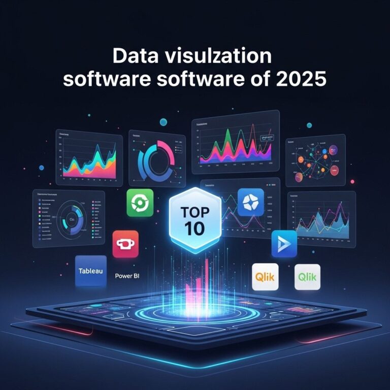
Top Data Visualization Software Examples
To further assist in your decision-making, here are some of the leading data visualization software options available, alongside their key features:
| Software | Key Features | Pricing |
|---|---|---|
| Tableau | Powerful analytics, drag-and-drop interface, extensive visualization options | Starts at $70/user/month |
| Microsoft Power BI | Seamless integration with Microsoft products, real-time dashboards, easy sharing | Starts at $9.99/user/month |
| QlikView | In-memory processing, interactive dashboards, strong associative searching | Contact for pricing |
| Looker | Data exploration, real-time collaboration, custom application building | Contact for pricing |
| Google Data Studio | Free, integrates with Google services, collaborative sharing | Free |
Evaluating Software Based on Use Case
Different organizations may have distinct needs for their data visualization tools. Here are some scenarios and which software would be most suitable:
1. For Business Intelligence
Software like Tableau and Power BI excels in business intelligence applications, providing comprehensive analytics and reporting features.
2. For Marketing Analytics
If you’re focusing on marketing efforts, Google Data Studio is a great choice due to its ability to create reports integrating with Google Analytics and Ads.
3. For Academic Research
QlikView and Looker can serve researchers well with their robust data manipulation and analysis capabilities.
Future Trends in Data Visualization
As technology evolves, so does the landscape of data visualization. Here are a few trends that will shape the future:
1. AI and Machine Learning
Integrating AI into data visualization tools will empower users to derive insights automatically, making visualization smarter and more predictive.
2. Augmented Reality (AR) and Virtual Reality (VR)
Expect to see more immersive and interactive visualizations using AR and VR, allowing users to explore data in 3D environments.
3. Real-Time Data Representation
With the rise of IoT, the need for real-time visualization will continue to grow, facilitating immediate decision-making based on live data.
Conclusion
Choosing the best data visualization software requires careful consideration of your specific needs and the software’s capabilities. By understanding the various types of visualizations, evaluating key features, and exploring top software options, you can make an informed decision that enhances your data analysis and reporting capabilities. Remember to keep an eye on emerging trends to stay ahead in the fast-evolving world of data visualization.
FAQ
What features should I look for in data visualization software?
When choosing data visualization software, consider features such as ease of use, integration capabilities, customization options, and the types of visualizations supported.
Are there free options for data visualization software?
Yes, there are several free data visualization tools available, such as Tableau Public, Google Data Studio, and OpenRefine, which can be great for basic visualization needs.
How does data visualization software improve decision-making?
Data visualization software helps improve decision-making by converting complex data sets into visual formats, making it easier to identify trends, patterns, and insights.
What are some popular data visualization software examples?
Popular data visualization software examples include Tableau, Microsoft Power BI, QlikView, and D3.js, each offering unique features and functionalities.
Can data visualization software handle real-time data?
Many data visualization tools, such as Power BI and Tableau, can handle real-time data, allowing users to create dynamic visualizations that update as new data becomes available.