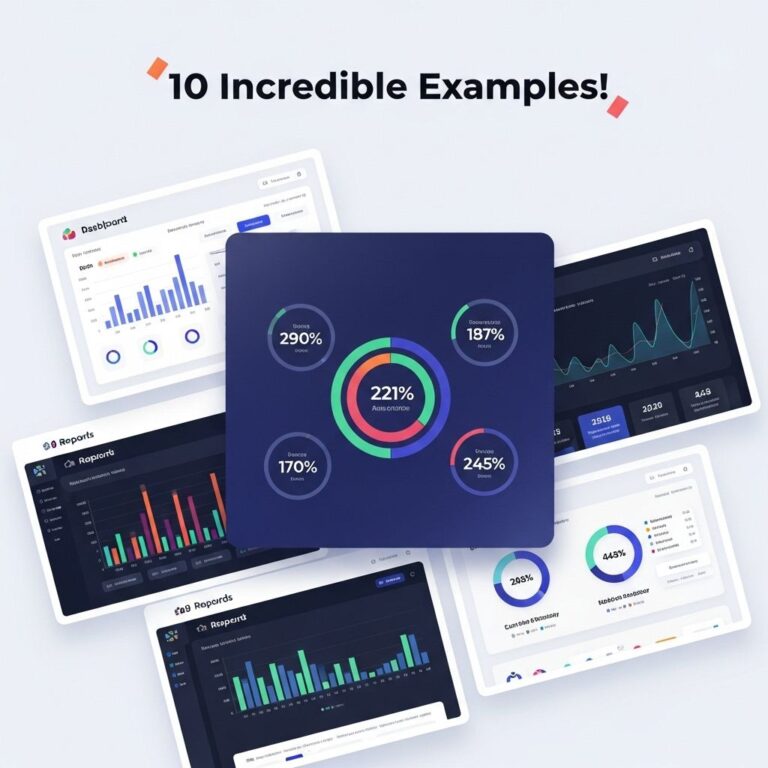
In the ever-evolving world of data analysis, data visualization tools have become indispensable for organizations aiming to make sense of large volumes of data. By presenting complex data in a visual context, these tools help stakeholders derive insights more effectively. As we look forward to 2025, a variety of data visualization software solutions are emerging, each offering unique features and capabilities. This article explores the top 10 data visualization software examples that are poised to dominate the market.
1. Tableau
Tableau has long been a leader in the data visualization space, and its continuous innovation keeps it at the forefront of the industry. Known for its user-friendly interface and powerful analytics capabilities, Tableau allows users to create interactive dashboards and share insights effortlessly.
Key Features:
- Drag-and-drop interface for easy dashboard creation
- Real-time data analytics
- Support for a wide range of data sources
- Extensive library of visualization types
2. Power BI
Microsoft’s Power BI has become a go-to tool for businesses invested in the Microsoft ecosystem. Its seamless integration with other Microsoft products makes it a convenient choice for users who frequently work with Excel, Azure, and other Microsoft applications.
Benefits of Power BI:
- Robust data modeling capabilities
- Natural language query support for easier insights
- Collaboration features via Microsoft Teams
- Customizable and reusable dashboards
3. D3.js
D3.js is a JavaScript library for producing dynamic, interactive data visualizations in web browsers. Its flexibility allows developers to create virtually any type of visualization they can imagine, making it a favorite among web developers and data scientists.
Advantages of D3.js:
- Highly customizable and adaptable for various use cases
- Supports a wide range of data formats
- Strong community support and extensive documentation
- Integrates well with popular frameworks and libraries
4. Looker
Looker, now part of Google Cloud, emphasizes data exploration and collaboration. It enables teams to create and share dashboards and reports, turning data analysis into a collaborative process.
Key Strengths:
- Data modeling layer for consistent metrics across reports
- Embedding capabilities for integrating visualizations into applications
- Integrated with BigQuery for handling large datasets
- Intuitive interface for both technical and non-technical users
5. Qlik Sense
Qlik Sense stands out for its associative data model that allows users to explore data freely without being constrained by predefined queries. This flexibility makes it easier for users to uncover hidden insights.
Features:
- Smart search for intuitive data exploration
- AI-powered insights and recommendations
- Responsive design for use on any device
- Collaboration tools for teams
6. Google Data Studio
Google Data Studio offers a free, cloud-based solution for creating customizable reports and dashboards. Its integration with other Google services makes it a popular choice for businesses that rely heavily on the Google ecosystem.
Notable Features:
- Drag-and-drop interface
- Real-time collaboration
- Easy sharing and publishing options
- Integration with Google Ads, Analytics, and other services
7. Sisense
Sisense focuses on simplifying complex data preparation and visualization processes. Its in-chip technology boosts performance by enabling faster data processing and visualization.
Benefits of Choosing Sisense:
- Ability to handle large datasets efficiently
- Built-in analytics for deeper insights
- Customizable dashboards for specific business needs
- API access for developers
8. Plotly
Plotly is a versatile tool that allows users to create interactive visualizations using Python, R, or JavaScript. It’s particularly popular in the data science community due to its flexibility and the ability to embed visualizations in web applications.
Why Use Plotly:
- Rich library of pre-built visualization types
- Supports 3D visualizations
- Collaboration tools for sharing insights
- Open-source options for developers
9. Infogram
Infogram focuses on making data visualization accessible to non-technical users. Its user-friendly platform allows users to create infographics, reports, and charts without any coding skills.
Key Features:
- Templates and design elements for quick creation
- Interactive charts and maps
- Easy export options for presentations
- Collaboration features for teams
10. Chart.js
Chart.js is a simple yet flexible JavaScript charting library that provides a range of chart types for web applications. It’s a lightweight option for developers looking to quickly add visualizations to their projects.
Advantages of Chart.js:
- Lightweight and easy to integrate
- Responsive and interactive charts
- Good documentation for developers
- Support for animated transitions between chart states
Conclusion
As we progress into 2025, the landscape of data visualization continues to grow and diversify. The tools mentioned above represent a mix of established leaders and innovative newcomers, each offering unique features that cater to different user needs. Choosing the right data visualization software depends on the specific requirements of your organization, including integration capabilities, ease of use, and the complexity of data analysis needed. By leveraging the right tools, organizations can enhance their decision-making processes and derive meaningful insights from their data.
FAQ
What are the top data visualization software examples in 2025?
In 2025, some of the leading data visualization software include Tableau, Power BI, Qlik Sense, D3.js, Looker, and Google Data Studio.
What features should I look for in data visualization software?
Key features to consider include user-friendly interface, integration capabilities, real-time data processing, customizable dashboards, and a variety of visualization options.
How important is data visualization in today’s business environment?
Data visualization is crucial as it helps businesses make sense of complex data, identify trends, and make informed decisions quickly.
Can I use data visualization software for real-time data analysis?
Yes, many data visualization tools support real-time data analysis, allowing users to visualize and interpret data as it is generated.
Is there a free data visualization software option available?
Yes, options like Google Data Studio and Tableau Public offer free versions that provide essential data visualization features.
How do I choose the right data visualization tool for my needs?
Consider factors such as the specific data types you work with, your budget, required features, and the level of technical expertise of your team when choosing a data visualization tool.