In today’s data-driven world, the ability to present information clearly and effectively is crucial for any organization. Whether you’re a business analyst, a data scientist, or just someone looking to share insights with colleagues, data visualization software can transform raw data into stunning reports that captivate your audience. This article explores various data visualization tools, their features, and how they can elevate your reporting game.
Understanding Data Visualization
Data visualization is the graphical representation of information and data. By using visual elements like charts, graphs, and maps, data visualization tools help users understand trends, outliers, and patterns in their data. Effective visualizations can make complex data more accessible and provide clarity that raw data alone cannot.
Why Use Data Visualization Software?
- Enhanced Understanding: Visuals can simplify complex data, making it easier to digest.
- Improved Insights: Identifying trends and patterns becomes quicker with visual representations.
- Increased Engagement: Beautifully designed visuals can keep your audience more engaged than spreadsheets.
- Better Decision-Making: Visual data can support quicker, informed decisions based on clear evidence.
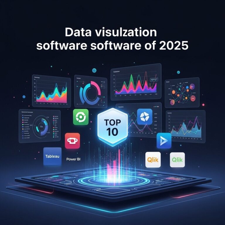
Popular Data Visualization Software Examples
There are numerous tools available on the market today, catering to various needs and skill levels. Here are some of the most popular data visualization software examples:
1. Tableau
Tableau is one of the most widely used data visualization tools. It allows users to create a variety of interactive and shareable dashboards.
Key Features:
- Drag-and-drop interface
- Real-time data analysis
- Integration with various data sources
- Collaborative features for sharing insights
2. Microsoft Power BI
Power BI is a powerful analytics tool that can convert raw data into informative and interactive visual reports.
Key Features:
- User-friendly interface
- Seamless integration with Microsoft products
- Customizable dashboards
- Access to a vast community of users for support
3. Google Data Studio
Google Data Studio offers an intuitive interface that enables users to create customizable and shareable reports.
Key Features:
- Free to use
- Easy collaboration with Google Workspace
- Wide range of data connectors
- Interactive elements such as filters and date ranges
4. QlikView
QlikView provides a powerful platform for data analysis with a focus on search-based analytics.
Key Features:
- Associative data model for deep insights
- Dynamic dashboards
- In-memory processing for fast performance
- Collaboration and sharing capabilities
5. D3.js
D3.js is a JavaScript library for producing dynamic, interactive data visualizations in web browsers.
Key Features:
- Highly customizable visuals
- Supports large datasets
- Integration with web standards
- Open-source and free to use
Choosing the Right Tool
Choosing the right data visualization software depends on several factors including your specific needs, the complexity of the data, and the intended audience. Here are some guidelines to help you decide:
Consider Your Audience
Understanding who will view your report is essential. Technical users may appreciate in-depth analytical tools, while non-technical stakeholders may benefit from simpler, more visual options.
Assess Your Data Sources
Make sure the software can connect to the data sources you use. If you’re working with multiple databases, choose a platform that supports integrations.
Evaluate Usability
Look for a tool with an easy learning curve. A user-friendly interface will allow you to create reports quickly and efficiently.
Cost Considerations
Budget is another important factor. Some tools are free, while others require subscriptions. Be sure to assess the cost against the features offered.
Best Practices for Creating Stunning Reports
Creating visually appealing and informative reports is not just about the software you use but also how you approach the design and content. Here are some best practices to consider:
1. Know Your Objective
Before you start, have a clear understanding of what you want to communicate. Define your key messages and what you want your audience to take away from the report.
2. Simplify Your Data
Avoid clutter. Only include data and visuals that support your key messages. Less is often more when it comes to data visualization.
3. Choose the Right Visuals
Different types of data may require different visualizations. Here are some common types:
| Type | Best Used For |
|---|---|
| Bar Charts | Comparing quantities across categories |
| Line Charts | Showing trends over time |
| Pie Charts | Displaying proportions |
| Heat Maps | Highlighting density of data points |
4. Use Color Wisely
Color can enhance your visualizations, but it can also confuse. Use a consistent color scheme and ensure sufficient contrast for readability.
5. Test and Iterate
Before finalizing your report, test it with a few trusted colleagues. Gather feedback and make necessary adjustments to improve clarity and impact.
Conclusion
Data visualization software is an invaluable tool for anyone looking to make sense of complex data and communicate insights effectively. By selecting the right software and applying best practices in your report design, you can create stunning visualizations that not only present data but also tell compelling stories. Whether you choose Tableau, Power BI, Google Data Studio, QlikView, or D3.js, the key is to keep your audience in mind and strive for clarity and engagement in every report you create.
FAQ
What is data visualization software?
Data visualization software is a tool that helps users create graphical representations of data, making it easier to understand complex information through charts, graphs, and interactive dashboards.
Why is data visualization important for reports?
Data visualization is important for reports because it enhances comprehension, enables quick insights, and allows stakeholders to grasp key findings at a glance, thus supporting better decision-making.
What are some examples of popular data visualization software?
Some popular data visualization software examples include Tableau, Microsoft Power BI, Google Data Studio, QlikView, and D3.js.
How can I create stunning reports using data visualization software?
To create stunning reports, choose the right visualization tools, use clear and engaging graphics, focus on key data points, and ensure your layout is user-friendly and visually appealing.
Can data visualization software integrate with other tools?
Yes, many data visualization software solutions offer integration capabilities with other tools like spreadsheets, databases, and business intelligence platforms to streamline data analysis.