In today’s fast-paced digital world, a logo serves as the face of a brand. It plays a crucial role in how businesses communicate their identity, values, and purpose. Minimalist logos, characterized by their simplicity and elegance, have become a popular choice among designers and brands alike. This article delves into the essentials of creating stunning minimalist logos that resonate with the audience and stand the test of time.
Understanding Minimalism in Logo Design
Before diving into the design process, it is essential to grasp the core principles of minimalism. Minimalism in logo design revolves around the idea of “less is more,” emphasizing clarity and ease of recognition.
Key Characteristics of Minimalist Logos
- Simplicity: Minimalist logos eliminate unnecessary elements, focusing on the essentials.
- Versatility: These logos are versatile, functioning well across various mediums and sizes.
- Timelessness: A well-designed minimalist logo stands the test of time, avoiding trends that may quickly fade.
- Memorability: The simplicity of minimalist designs contributes to better brand recall.
Steps to Create a Minimalist Logo
Creating a minimalist logo involves a series of thoughtful steps. Below is a structured approach that can guide you through the design process:
1. Research and Inspiration
Begin by gathering inspiration. Research existing minimalist logos and analyze what makes them effective. Tools like Dribbble, Behance, and Pinterest can provide a wealth of visual ideas.
2. Define Your Brand
Understanding your brand is crucial for effective logo design. Consider the following:
- Brand Values: What values does your brand represent?
- Target Audience: Who are you trying to reach?
- Brand Personality: Is your brand playful, serious, modern, or traditional?
3. Choose the Right Colors
Colors evoke emotions and communicate messages. When designing a minimalist logo, consider the psychology of colors:
| Color | Emotion | Brand Examples |
|---|---|---|
| Red | Passion, Energy | Coca-Cola, YouTube |
| Blue | Trust, Stability | Facebook, IBM |
| Green | Growth, Health | Starbucks, Whole Foods |
| Black | Elegance, Sophistication | Chanel, Nike |
4. Select Typography
The choice of typography can significantly impact the perception of your logo. For minimalist logos, consider:
- Choosing clean, sans-serif fonts.
- Avoiding intricate scripts or overly decorative fonts.
- Ensuring the font is legible at various sizes.
5. Sketch Ideas
Start by sketching multiple ideas on paper. This helps you visualize concepts without the constraints of software. Don’t hesitate to explore various shapes and styles.
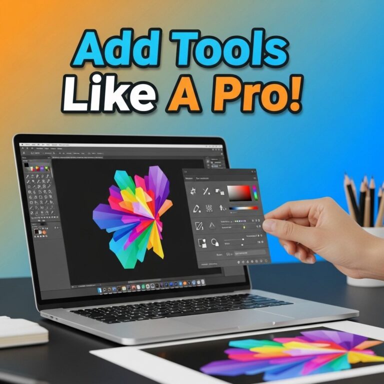
6. Utilize Design Software
Once you have a selection of sketches, it’s time to digitize them. Software tools such as Adobe Illustrator, CorelDRAW, or free alternatives like Inkscape can be excellent for logo creation.
7. Focus on Scalability
A successful minimalist logo is scalable. Ensure that it maintains its integrity when resized. Test it in various sizes, from business cards to billboards, to ensure versatility.
8. Seek Feedback
Feedback is invaluable in the design process. Share your logo with trusted peers or potential customers and gather their impressions. Be open to constructive criticism, as it can enhance your final design.
Common Mistakes to Avoid
Even experienced designers can fall into traps when creating minimalist logos. Here are some common pitfalls to watch out for:
- Overcomplicating Designs: Remember, simplicity is key. Avoid adding unnecessary elements.
- Choosing the Wrong Colors: Ensure your color palette aligns with your brand’s identity.
- Neglecting Scalability: Always design with different use cases in mind.
- Lack of Originality: Strive for a unique design that sets your brand apart.
Examples of Successful Minimalist Logos
To illustrate the principles discussed, let’s examine a few successful minimalist logos that epitomize effective design:
- Apple: The iconic apple silhouette effectively communicates innovation and simplicity.
- Nike: The Swoosh is a simple yet powerful representation of movement and athleticism.
- Adidas: The three stripes create an instantly recognizable brand symbol that is clean and effective.
- McDonald’s: The golden arches are universally recognized and embody the brand’s identity.
Conclusion
Creating a stunning minimalist logo is both an art and a science. By understanding the principles of minimalism and following a structured approach, designers can produce logos that effectively communicate brand identity while remaining timeless and versatile. Remember to embrace simplicity, focus on clarity, and most importantly, let your brand’s personality shine through your design. With the right attention to detail and creativity, your minimalist logo can leave a lasting impression on your audience.
FAQ
What are the key elements of a minimalist logo?
The key elements of a minimalist logo include simplicity, clarity, and effective use of negative space, often focusing on geometric shapes and limited color palettes.
What tools can I use to design a minimalist logo?
You can use graphic design software like Adobe Illustrator, Canva, or Sketch to create stunning minimalist logos.
How do I choose the right color palette for my minimalist logo?
Choose a color palette that reflects your brand’s personality and values, typically opting for one to three colors to maintain simplicity.
What fonts work best for minimalist logos?
Sans-serif fonts are often preferred for minimalist logos due to their clean lines and modern appearance.
Can I create a minimalist logo without professional design skills?
Yes, there are many online logo makers and templates available that allow you to create minimalist logos even without professional design skills.
How do I ensure my minimalist logo is versatile?
Make sure your minimalist logo works well in various sizes and formats, from business cards to digital use, by testing its clarity and recognition in different contexts.