In the digital age, data is generated at an unprecedented rate, and the ability to visualize this data effectively is crucial for businesses and organizations seeking to make informed decisions. Data visualization software empowers users to convert complex datasets into visual representations, making trends, patterns, and insights more accessible. In this article, we will explore the top tools available for data visualization, focusing on their unique features, strengths, and how they can enhance your data storytelling.
Understanding Data Visualization
Data visualization is the graphical representation of information and data. By using visual elements like charts, graphs, and maps, data visualization tools provide an accessible way to see and understand trends, outliers, and patterns in data.
Importance of Data Visualization
- Enhances Understanding: Visuals help simplify complex information, making it easier for stakeholders to grasp key insights.
- Improves Decision Making: Quick access to visual data allows for faster and more informed decision-making.
- Identifies Trends: Visual representation highlights trends over time, helping in forecasting and strategic planning.
- Increases Engagement: Visual tools are typically more engaging than raw data, capturing audience interest effectively.
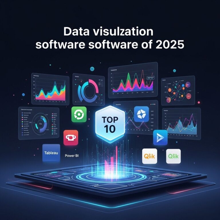
Popular Data Visualization Tools
1. Tableau
Tableau is a leading data visualization tool known for its capability to create a wide range of interactive and shareable dashboards. It connects to various data sources, allowing for real-time data analysis.
Key Features:
- Drag-and-drop interface for ease of use.
- Advanced analytics capabilities with forecasting and trend analysis.
- Integration with multiple databases and cloud services.
- Interactive dashboards accessible on multiple devices.
2. Microsoft Power BI
Microsoft Power BI offers powerful data visualization and business intelligence capabilities that allow users to visualize and share insights across their organization. It integrates seamlessly with other Microsoft products.
Key Features:
- Robust data connectivity options with over 70 connectors.
- Natural language query functionality.
- Automated report generation and sharing.
- Custom visualizations with a community-driven marketplace.
3. D3.js
D3.js is a JavaScript library for producing dynamic, interactive data visualizations in web browsers. It is particularly favored by developers due to its flexibility and the ability to create bespoke, complex visuals.
Key Features:
- High level of customization for creating unique visual representations.
- Utilizes web standards such as SVG, HTML5, and CSS.
- Supports large datasets and dynamic updates.
- Strong community and extensive documentation.
4. Google Data Studio
Google Data Studio is a free tool that transforms data into informative, easy-to-read, easy-to-share, and fully customizable dashboards and reports. It’s particularly effective for users already within the Google ecosystem.
Key Features:
- Integration with Google products like Analytics and Sheets.
- Real-time collaboration and sharing capabilities.
- Wide variety of data visualizations available.
- User-friendly interface with drag-and-drop functionality.
5. Qlik Sense
Qlik Sense offers a feature-rich platform that provides self-service data visualization and analytics. Its associative model enables users to analyze data in a variety of ways.
Key Features:
- Associative data model allowing for intuitive data exploration.
- Smart search for instant insights.
- Responsive design for mobile and web applications.
- AI-powered augmentation for data insights.
Comparative Analysis of Tools
| Tool | Best For | Pricing | Platform |
|---|---|---|---|
| Tableau | Complex data analysis | Subscription-based | Windows, macOS, Online |
| Power BI | Microsoft ecosystem users | Free tier & Subscription | Windows, Online |
| D3.js | Custom web visualizations | Free | Web-based |
| Google Data Studio | Google product users | Free | Web-based |
| Qlik Sense | Self-service analytics | Subscription-based | Windows, Cloud |
Best Practices for Using Data Visualization Tools
1. Define Clear Objectives
Before diving into visualizations, it’s essential to establish what you want to achieve. Clear objectives help guide the choice of metrics and visual styles.
2. Choose the Right Visualization
Different types of data require different types of visuals. Here are some common types:
- Bar Charts: Great for comparing quantities.
- Line Graphs: Ideal for showing trends over time.
- Pie Charts: Useful for showing proportional relationships.
- Heat Maps: Effective for displaying data density.
3. Keep It Simple
Avoid cluttering visuals with excessive information. A clean, simple design improves readability and understanding.
4. Use Colors Wisely
Colors can convey meaning and draw attention. Use a consistent color scheme that aligns with your branding and ensures accessibility.
5. Test and Iterate
Once a visualization is created, test it with your audience to ensure it conveys the intended message. Be open to feedback and ready to make adjustments.
Conclusion
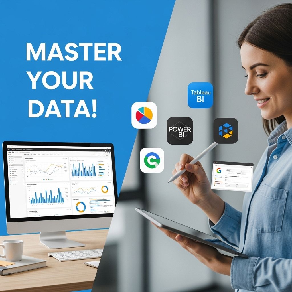
Data visualization is an essential skill in today’s data-driven world. The right tools, combined with effective best practices, can significantly enhance how businesses interpret and leverage their data. Whether you opt for user-friendly platforms like Tableau and Power BI or delve into more customizable options like D3.js, mastering these tools can elevate your data storytelling and decision-making processes.
FAQ
What are the best data visualization tools available?
Some of the best data visualization tools include Tableau, Microsoft Power BI, QlikView, Google Data Studio, and D3.js.
How can I improve my data visualization skills?
To improve your data visualization skills, consider taking online courses, practicing with various visualization tools, studying design principles, and analyzing successful visualizations.
What features should I look for in data visualization software?
When choosing data visualization software, look for features such as user-friendly interface, data integration capabilities, interactive dashboards, customization options, and strong support and community.
Is coding required for data visualization tools?
While some data visualization tools like D3.js require coding knowledge, many others, like Tableau and Power BI, offer drag-and-drop interfaces that do not require programming skills.
How do I choose the right data visualization tool for my business?
To choose the right data visualization tool for your business, assess your specific needs, budget, user skill level, and the types of data you work with to ensure compatibility.
Can data visualization tools help in decision-making?
Yes, data visualization tools can significantly enhance decision-making by providing clear insights and trends from complex data sets, making it easier to understand and communicate findings.