
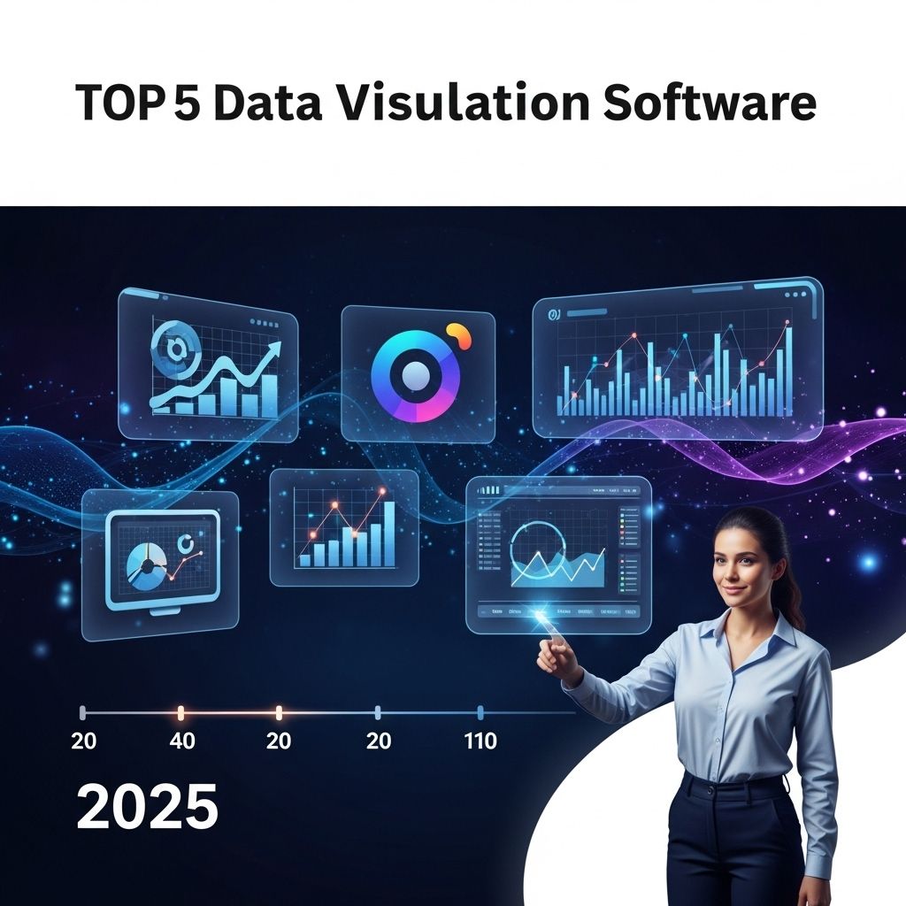
As we venture into 2025, the demand for data visualization tools continues to surge, helping organizations make sense of vast amounts of data and presenting it in an accessible format. In the era of big data, effective visualization software is not just a luxury; it is a necessity for companies looking to gain insights and drive decision-making. This article explores the top five data visualization software examples that are set to dominate the landscape in 2025.
Understanding Data Visualization
Data visualization is the graphical representation of information and data. By using visual elements like charts, graphs, and maps, data visualization tools enable users to see and understand trends, outliers, and patterns in data. Here are some key benefits:
- Clarity: Data visualization simplifies complex data, making it easier to interpret.
- Engagement: Visuals capture attention and are more engaging than textual data.
- Quick Insights: Users can identify trends and patterns quickly, leading to faster decision-making.
- Storytelling: Effective visualizations can tell a compelling story about the data.
Criteria for Selecting Data Visualization Software
When choosing data visualization software, consider the following factors:
- User-Friendliness: An intuitive interface that allows users of all skill levels to create visualizations.
- Integration Options: Compatibility with various data sources, including databases, spreadsheets, and APIs.
- Customization Capabilities: The ability to customize visualizations to meet specific needs.
- Collaboration Features: Tools that facilitate collaboration among team members.
- Cost: Pricing structures that fit within your organization’s budget.
1. Tableau
Tableau has long been a leader in the data visualization space, and its 2025 iteration promises even more robust features. Known for its powerful analytics and user-friendly interface, Tableau allows users to connect to multiple data sources and create interactive dashboards.
Key Features:
- Real-Time Data Analysis: Users can visualize changes in data as they happen.
- Drag-and-Drop Functionality: Easily create and customize visualizations with a simple drag-and-drop interface.
- Collaboration Tools: Share reports and dashboards with team members in real-time for collaborative decision-making.
Use Cases:
| Industry | Application |
|---|---|
| Healthcare | Patient data analysis and resource allocation |
| Finance | Trend analysis and financial reporting |
| Retail | Sales performance monitoring |
2. Microsoft Power BI
Microsoft Power BI continues to gain traction due to its integration with the Microsoft ecosystem. As of 2025, it has evolved into a more powerful tool for data analysis and visualization, suitable for businesses of all sizes.
Key Features:
- Seamless Integration: Deep integration with Microsoft Excel and Azure services.
- AI-Powered Analytics: Leverage machine learning capabilities to gain deeper insights from data.
- Custom Visuals Marketplace: Access a marketplace for additional visual components tailored to specific needs.
Use Cases:
| Industry | Application |
|---|---|
| Education | Student performance tracking |
| Manufacturing | Production monitoring and efficiency analysis |
| Marketing | Campaign performance assessment |
3. Qlik Sense
Qlik Sense stands out for its associative data model, which allows users to explore data freely without being limited to predefined queries. This flexibility is essential for discovering insights that may be overlooked in traditional data analysis tools.
Key Features:
- Self-Service Visualization: Users can create their own dashboards and reports without needing IT assistance.
- Smart Search: Quickly find data and insights across various datasets.
- Data Storytelling: Combine visualizations with narratives to enhance data presentations.
Use Cases:
| Industry | Application |
|---|---|
| Energy | Resource management and forecasting |
| Telecommunications | Customer churn analysis |
| Government | Public safety and resource allocation |
4. Looker
Looker is known for its strong data modeling capabilities, which enable users to derive insights from complex datasets. Emphasizing collaboration, Looker helps teams work together to make data-driven decisions.
Key Features:
- Embedded Analytics: Integrate analytics into existing applications for a seamless user experience.
- Data Governance: Ensure data accuracy and accessibility for all users.
- LookML: A modeling language that allows users to create reusable data models.
Use Cases:
| Industry | Application |
|---|---|
| Finance | Investment analysis and risk management |
| Retail | Customer segmentation and targeting |
| Healthcare | Operational efficiency tracking |
5. D3.js
D3.js remains a favorite among developers for its flexibility and control over the visualization process. As an open-source JavaScript library, D3.js allows for the creation of highly customizable and interactive visualizations.
Key Features:
- Full Control: Developers can manipulate the DOM to create unique visualizations.
- Data-Driven Transformation: Bind data to the Document Object Model (DOM) for dynamic visual updates.
- Wide Community Support: A large community contributes plugins and extensions for added functionality.
Use Cases:
| Industry | Application |
|---|---|
| Technology | Custom dashboard creation |
| Education | Interactive statistical visualizations |
| Entertainment | Data storytelling for user engagement |
Conclusion
The landscape of data visualization software in 2025 will be dominated by tools that offer versatility, integration, and user-centric features. Companies that harness the power of these tools will not only enhance their data analysis capabilities but also foster a culture of data-driven decision-making. As technology continues to evolve, keeping abreast of the latest trends in data visualization will be essential for any organization aiming to succeed in the digital era.
FAQ
What are the top data visualization software examples for 2025?
The top data visualization software examples for 2025 include Tableau, Power BI, Looker, D3.js, and Qlik Sense.
How does Tableau stand out among data visualization tools?
Tableau stands out for its user-friendly interface, powerful analytics capabilities, and extensive integration options with various data sources.
What features make Power BI a popular choice for businesses?
Power BI is popular due to its affordability, seamless integration with Microsoft products, and robust data modeling capabilities.
Why is D3.js considered a top choice for custom data visualizations?
D3.js is favored for its flexibility and ability to create highly customized, interactive visualizations using web standards.
What are the advantages of using Qlik Sense for data visualization?
Qlik Sense offers a unique associative model, allowing users to explore data freely, and provides smart visualizations that help uncover insights.
How can Looker enhance data-driven decision-making?
Looker enhances data-driven decision-making through its powerful data modeling language and ability to create tailored dashboards for specific business needs.


