
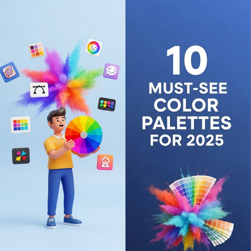
As we approach the year 2025, color trends are becoming increasingly vibrant and complex, reflecting our evolving aesthetic sensibilities. Designers, artists, and brands are continuously exploring new hues and combinations that resonate with contemporary themes ranging from sustainability to digital innovation. This article delves into ten must-see color palettes for 2025 that are not only visually stunning but also rich in meaning and context.
1. Neo-Mint and Coral
This palette marries the soft, tranquil vibes of Neo-Mint with the vivacious energy of Coral. The soothing characteristics of mint green help create a calming atmosphere, perfect for wellness and lifestyle brands, while coral infuses a touch of warmth and optimism.
Applications
- Interior Design: Ideal for creating serene spaces.
- Fashion: Perfect for summer collections.
- Branding: Works well for tech and health industries.
2. Earthy Tones with a Twist
Incorporating shades of clay, terracotta, and ochre, this palette resonates with nature while adding depth through unique twists—like dusky blues and muted greens. The balance of warm and cool tones makes it versatile for various applications.
Color Codes
| Color Name | Hex Code |
|---|---|
| Clay | #C06A4D |
| Terracotta | #D76D3B |
| Dusky Blue | #4C5B5E |
| Muted Green | #A8B2A1 |
3. Electric Pastels
Electric pastels bring an energetic twist to traditional soft hues, making them vibrant and eye-catching. This palette includes candy pinks, minty greens, and soft yellows that can elevate any design project.
Why Choose Electric Pastels?
- Attract attention without overwhelming.
- Ideal for playful branding.
- Perfect for technology and gaming industries.
4. Deep Ocean Blues
Inspired by the depths of the ocean, this palette features dark navy, teal, and azure shades. Rich and evocative, these colors convey stability and sophistication, ideal for corporate branding.
Examples of Use
- Corporate Identity: Banks and financial institutions.
- Web Design: Professional websites.
5. Retro-Futuristic Neons
This palette embraces a nostalgic yet forward-looking aesthetic, featuring hot pinks, electric blues, and bright yellows. Perfect for capturing attention in advertisements, this palette is a nod to the 80s while looking ahead.
Design Tips
Utilize these colors sparingly in accents for maximum effect. Consider:
- Graphic Design: Posters and flyers.
- Web Design: Interactive elements.
6. Minimalist Monochromes
For those who prefer a more understated approach, minimalist monochromes provide a calming effect. Utilizing shades of grey, black, and white can create a sophisticated and timeless design.
Benefits
- Easy to implement across various platforms.
- Fosters a cohesive brand identity.
- Timeless aesthetic appeal.
7. Warm Naturals
Think of sandy beiges, warm whites, and muted browns—this palette evokes a sense of comfort and tranquility, perfect for brands focused on sustainability and earth-friendly products.
Where to Apply
- Home Goods: Furniture and decor.
- Food Industry: Restaurants focusing on organic materials.
8. Jewel Tones
Rich, bold colors like emerald green, sapphire blue, and ruby red are making a comeback in 2025. These hues add a touch of luxury and elegance to any design, perfect for high-end products.
Utilization Strategies
- Fashion: Evening wear and accessories.
- Branding: Luxury products and services.
9. Color of the Year: Radiant Orchid
After being voted the ‘Color of the Year’ by various color institutes, Radiant Orchid continues to inspire designers. This vibrant purple can be paired with greens or neutrals for striking contrasts.
Color Combinations
Suggestions for pairing:
- With Greens: Creates a fresh garden vibe.
- With Neutrals: Adds a pop without overpowering.
10. Digital Hues
As our lives become more intertwined with technology, the palette that embodies the digital age is crucial. Incorporating shades resembling screen colors—bright blues, neon pinks, and vivid greens—can resonate with tech-savvy audiences.
Potential Uses
- Marketing: Capture the attention of younger demographics.
- Web Design: Enhance user engagement.
In conclusion, color palettes in 2025 promise to be as diverse as the audiences they serve. From calming earthy tones to vibrant electric pastels, there are endless possibilities for designers to explore. Choosing the right palette can be the difference between a forgettable design and one that resonates deeply with viewers. The challenge lies not just in picking colors but in understanding their emotional impact and cultural significance in our ever-evolving world.
FAQ
What are the top color palettes for 2025?
The top color palettes for 2025 include vibrant hues, earthy tones, and pastel shades that evoke a sense of calm and creativity.
How can I choose a color palette for my home in 2025?
To choose a color palette for your home in 2025, consider your personal style, the mood you want to create, and the latest design trends.
What are some popular color combinations for interiors in 2025?
Popular color combinations for interiors in 2025 include teal and coral, mustard yellow and navy, and soft lavender with cream.
How do color palettes impact mood and atmosphere?
Color palettes significantly impact mood and atmosphere by influencing emotions, creating energy, or promoting relaxation.
Are there any seasonal color trends for 2025?
Yes, seasonal color trends for 2025 will focus on warm autumnal colors, fresh spring pastels, and vibrant summer shades.
Where can I find inspiration for color palettes in 2025?
You can find inspiration for color palettes in 2025 through design magazines, social media platforms like Pinterest, and online color trend reports.
