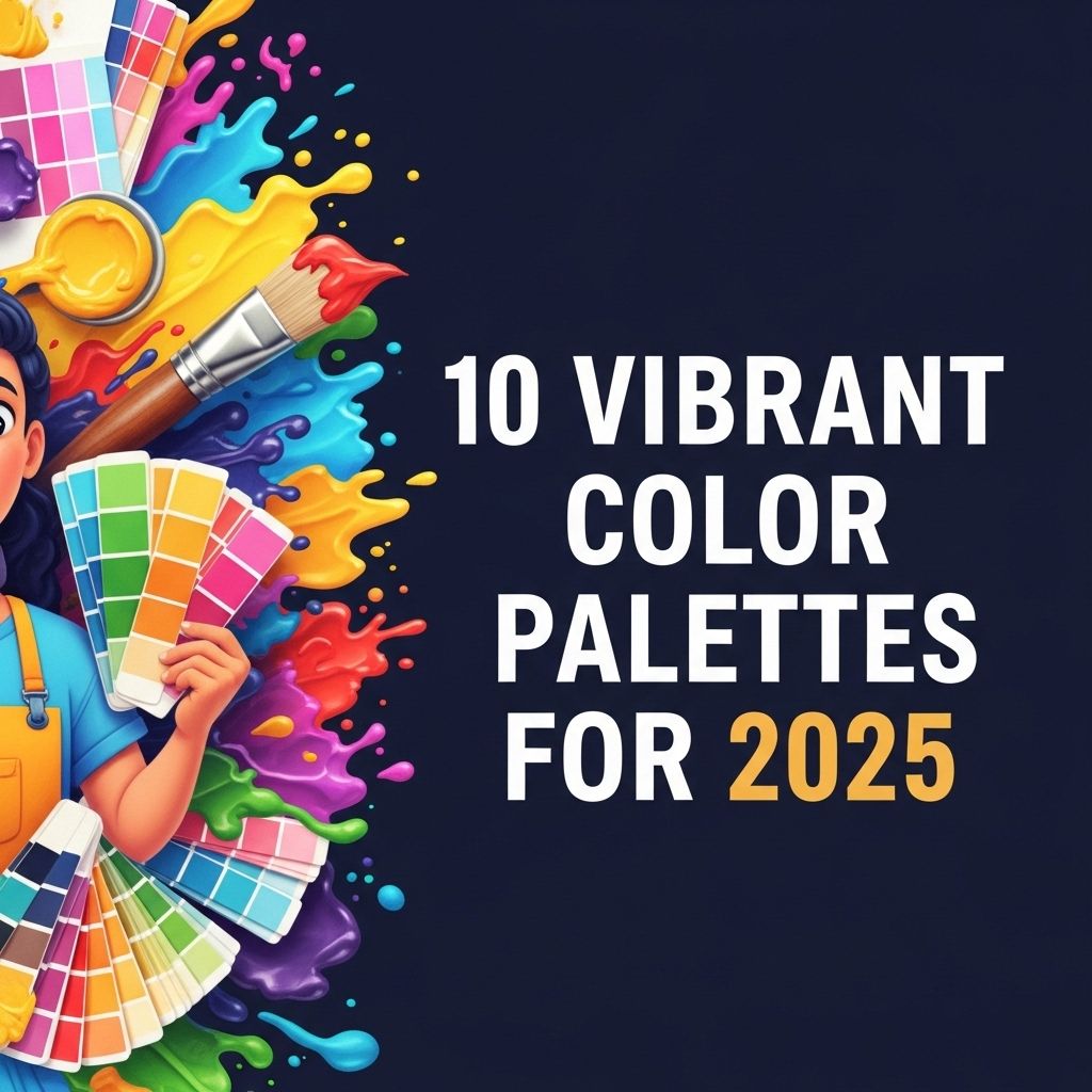
The world of design is ever-evolving, and staying ahead of trends is crucial for any creative professional. As we move into 2025, we find ourselves at a crossroads where technology, sustainability, and aesthetics intersect. Vibrant colors will play a significant role in captivating audiences and elevating design projects. In this article, we will explore ten vibrant color palettes that are set to dominate the creative landscape in 2025.
Understanding Color Theory
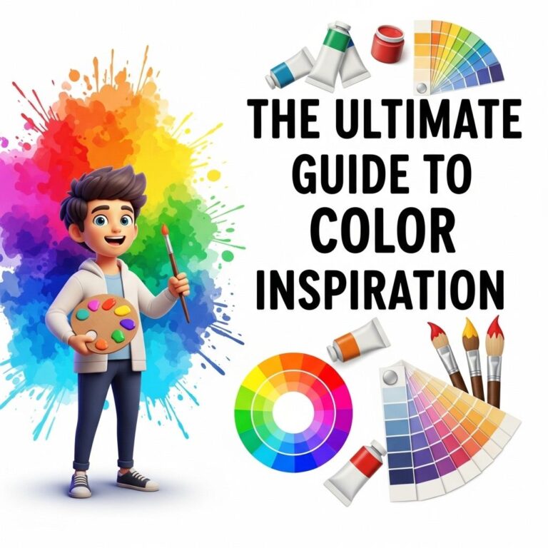
Before diving into the palettes, it’s essential to grasp some basics of color theory. Color theory encompasses the principles and guidelines that govern how colors interact with each other. Some key concepts include:
- Primary Colors: Red, blue, and yellow are the foundational colors that can be mixed to create a range of hues.
- Complementary Colors: Colors that are opposite each other on the color wheel, such as blue and orange, create a striking visual contrast.
- Analogous Colors: Colors that are next to each other on the wheel, like blue, blue-green, and green, provide a more harmonious look.
Palette Inspirations for 2025
With a solid foundation in color theory, let’s explore ten vibrant color palettes that will inspire designers in 2025. Each palette represents a unique mood and can be utilized across various design disciplines, from graphic design to interior decor.
1. Techno Neon
This palette is reminiscent of the vibrant nightlife and is packed with electrifying colors.
| Color | Hex Code |
|---|---|
| Electric Blue | #00BFFF |
| Hot Pink | #FF1493 |
| Lime Green | #32CD32 |
| Vivid Orange | #FF4500 |
| Purple | #800080 |
2. Earthy Tones
Combining vibrant hues with earthiness creates a grounded yet lively palette.
- Terracotta: #D95F3D
- Olive Green: #708238
- Sunshine Yellow: #FFEA00
- Rust Red: #A0522D
3. Pastel Pops
This palette blends soft pastels with bold accents, making it playful and versatile.
- Soft Lavender: #E6E6FA
- Mint Green: #98FF98
- Peach: #FFDAB9
- Coral: #FF7F50
4. Ocean Depths
Inspired by the ocean’s vibrancy, this palette features deep and lively colors.
- Deep Sea Blue: #1E90FF
- Tropical Teal: #008080
- Coral Reef: #FF6347
- Sandy Beige: #F5DEB3
5. Futuristic Hues
This palette focuses on colors that evoke a sense of the future and innovation.
| Color | Hex Code |
|---|---|
| Cyan | #00FFFF |
| Silver | #C0C0C0 |
| Neon Coral | #FF6F61 |
| Bright Yellow | #FFD700 |
6. Rustic Revival
These colors reflect a return to nature, filled with warmth and nostalgia.
- Burnt Sienna: #E74C3C
- Mustard Yellow: #FFC300
- Forest Green: #228B22
- Sky Blue: #87CEEB
7. Monochromatic Vibrance
This palette explores various shades and tints of a single color family, creating depth and richness.
- Shades of Blue: from #0000FF to #ADD8E6
- Shades of Red: from #FF0000 to #FFB6C1
- Shades of Green: from #008000 to #98FB98
8. Bold Contrast
Utilizing high-contrast colors can create striking visuals that demand attention.
- Black: #000000
- Bright Yellow: #FFFF00
- Royal Blue: #4169E1
- Crimson: #DC143C
9. Floral Palette
Inspired by blooming flowers, this palette is vibrant and full of life.
| Color | Hex Code |
|---|---|
| Poppy Red | #FF4500 |
| Lavender | #E6E6FA |
| Sunflower Yellow | #FFD700 |
| Sky Blue | #87CEEB |
10. Urban Jungle
Combining bright hues with urban elements creates a vibrant yet gritty aesthetic.
- Concrete Grey: #7D7D7D
- Neon Pink: #FF1F8E
- Graffiti Green: #00B140
- Accent Gold: #FFD700
Using Color Palettes Effectively
Choosing the right color palette goes beyond mere aesthetics; it influences moods, perceptions, and even user engagement. Here are some tips for utilizing color palettes effectively:
1. Know Your Audience
Understanding the preferences and cultural associations of your target audience can help you choose a color palette that resonates with them.
2. Consider the Medium
The medium in which the design will be utilized (print, digital, textile, etc.) can affect color choices and combinations.
3. Test and Iterate
Don’t hesitate to test different color combinations and solicit feedback to refine your palette for optimal impact.
Conclusion
As we embrace 2025, vibrant color palettes are set to invigorate the design landscape. By understanding color theory and leveraging these ten inspiring palettes, designers can create compelling visuals that not only capture attention but also evoke emotion and connection. As technology continues to evolve, so too will our approach to color, ensuring that design remains a vibrant and essential component of our experiences.
FAQ
What are the top color palettes for 2025?
The top color palettes for 2025 include vibrant shades inspired by nature, bold contrasts, and soothing pastels that reflect current design trends.
How can I incorporate vibrant color palettes into my home decor?
You can incorporate vibrant color palettes into your home decor by using accent walls, colorful furnishings, or decorative accessories that feature these hues.
Are there specific colors trending for fashion in 2025?
Yes, in 2025, colors like electric blue, sunny yellow, and rich emerald green are expected to be prominent in fashion collections.
What are some examples of nature-inspired color palettes for 2025?
Nature-inspired color palettes for 2025 may include earthy tones like terracotta, forest green, and ocean blue, mirroring the beauty of the outdoors.
How do I choose a color palette that reflects my personal style?
To choose a color palette that reflects your personal style, consider your favorite colors, the mood you want to create, and how the colors will work together in your space.
What is the significance of color trends in design?
Color trends in design are significant because they influence consumer preferences, set the tone for visual aesthetics, and can evoke emotions and responses in viewers.