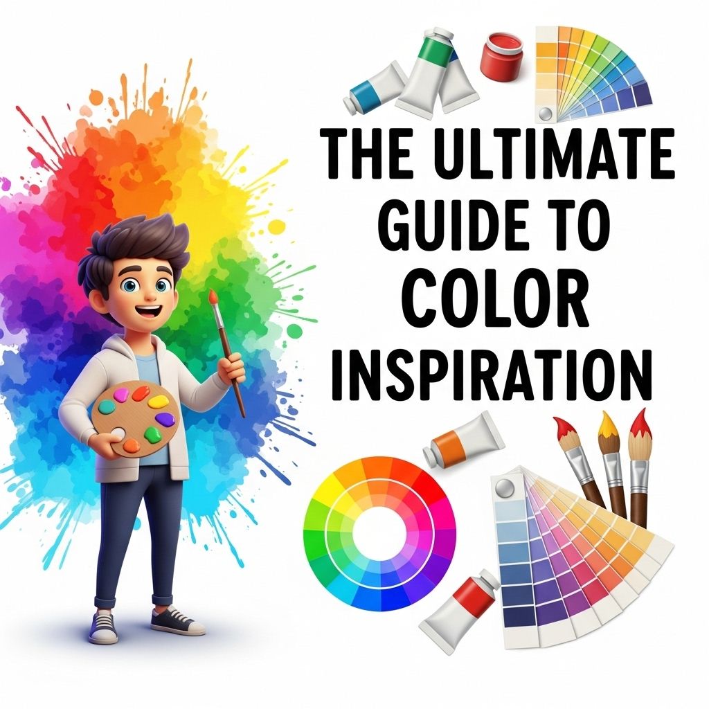
Color is a powerful tool that can evoke emotions, set the mood, and even influence decisions. For designers, marketers, and artists alike, understanding and leveraging color inspiration is crucial for creating compelling visuals. In this article, we will explore various sources of color inspiration, techniques for color selection, and how to effectively apply color theory in your projects.
Understanding Color Theory
Before diving into color inspiration, it’s essential to grasp the basics of color theory. This foundational knowledge will enable you to choose color palettes that resonate with your audience.
The Color Wheel
The color wheel is a circular diagram representing the relationships between colors. It consists of primary, secondary, and tertiary colors:
- Primary Colors: Red, Yellow, Blue
- Secondary Colors: Green, Orange, Purple (created by mixing primary colors)
- Tertiary Colors: Six colors made by mixing primary and secondary colors
Color Harmonies
To create visually appealing designs, you can use color harmonies. Here are some popular ones:
| Harmony | Description |
|---|---|
| Complementary | Colors opposite each other on the color wheel |
| Analogous | Colors next to each other on the color wheel |
| Triadic | Three colors evenly spaced around the color wheel |
| Monochromatic | Different shades and tints of a single color |
Sources of Color Inspiration
When looking for color inspiration, the world around us is filled with palettes waiting to be discovered. Here are some excellent sources:
Nature
Observing natural landscapes can yield stunning color combinations. Consider the following:
- Sunsets and Sunrises: The warm hues of orange, pink, and purple
- Forests: Various shades of green complemented by earthy browns
- Flowers: Bright and vibrant colors that can inspire bold palettes
Art and Design
Art history is replete with stunning color choices. From Impressionism to Pop Art, exploring different movements can provide fresh inspiration:
- Impressionism: Soft pastels and natural colors
- Expressionism: Bold, expressive colors
- Minimalism: Neutral tones with pops of color for emphasis
Fashion Trends
The fashion industry is a trendsetter when it comes to color palettes. Pay attention to:
- Seasonal Color Trends: Pantone’s Color of the Year
- Runway Shows: Observe what colors are prominent on the catwalk
- Street Style: Everyday fashion can reveal emerging color trends
Techniques for Selecting Colors
Once you have gathered inspiration, selecting the right colors for your project is the next step. Here are some techniques to consider:
Use Color Palettes
Color palette generators can streamline the process of selecting colors. Some popular tools include:
- Adobe Color: Create custom color schemes and explore trending palettes
- Coolors: Generate color schemes with just a click
- Color Hunt: Browse curated color palettes for inspiration
Consider Your Audience
Understanding your target audience is vital in color selection. Different colors can evoke different emotions and associations:
- Red: Excitement, passion
- Blue: Trust, calmness
- Green: Growth, nature
Test in Context
Always test your color choices within the context of your design. Mockups can help visualize how colors will interact:
- Create digital mockups to see how colors work together
- Gather feedback from peers or target users
- Make adjustments before final implementation
Applying Color in Your Projects
With your chosen color palette in hand, it’s time to apply these colors effectively in your designs:
Web Design
Color plays a crucial role in web design. Consider the following:
- Use contrasting colors for text and backgrounds to enhance readability
- Limit your palette to three to five colors for consistency
- Utilize color psychology to guide user actions (e.g., using red for call-to-action buttons)
Branding
Colors are an integral part of brand identity:
- Choose colors that reflect your brand’s values and personality
- Consistency across all platforms strengthens brand recognition
- Reevaluate and update colors as your brand evolves
Print Design
In print design, color fidelity is essential:
- Understand the difference between RGB (digital) and CMYK (print) color models
- Always proof colors before printing to avoid discrepancies
- Consider the paper type, as it can affect color appearance
Conclusion
Color inspiration is everywhere, and by understanding color theory, exploring diverse sources, and applying effective techniques, you can create designs that resonate deeply with your audience. Whether you are working on a personal project or a commercial endeavor, harness the power of color to elevate your work to new heights.
FAQ
What is color inspiration?
Color inspiration refers to the process of finding and selecting colors that evoke emotions, enhance design, and create visual interest in various projects.
How can I find color inspiration for my projects?
You can find color inspiration through resources like design blogs, social media platforms like Pinterest and Instagram, nature, art, and color palette generators.
What are some popular color schemes to consider?
Popular color schemes include monochromatic, complementary, analogous, triadic, and tetradic, each offering a unique way to combine colors harmoniously.
How does color affect mood and perception?
Colors can significantly influence emotions and perceptions; for example, blue often conveys tranquility, while red can evoke excitement or urgency.
What tools can help me choose a color palette?
Tools like Adobe Color, Coolors, and Canva’s color palette generator can assist in creating appealing color palettes for your designs.
Can color trends change over time?
Yes, color trends can change based on cultural influences, fashion, and design movements, making it important to stay updated with current color trends.