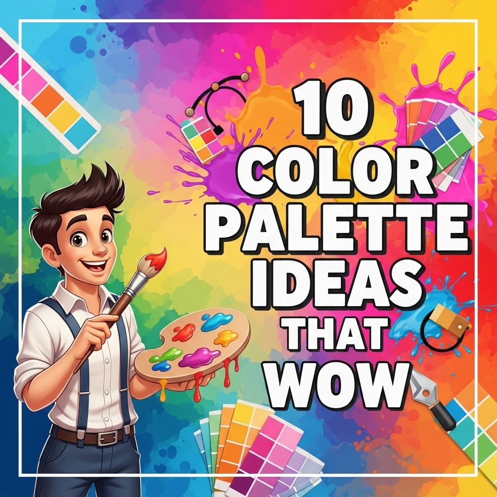
In the vibrant world of design, color plays a pivotal role in creating moods, evoking emotions, and crafting visual stories. Whether you’re designing a website, creating an advertisement, or simply refreshing your living space, the right color palette can make all the difference. In this article, we will explore ten color palette ideas that are sure to inspire and impress, each accompanied by practical applications and tips for use.
Understanding Color Theory
Before diving into specific color palettes, it’s essential to understand the basics of color theory. Here are some key concepts:
- Hue: The name of a color, which can include red, blue, yellow, etc.
- Saturation: The intensity of a color, which can range from vibrant to dull.
- Value: The lightness or darkness of a color.
- Complementary colors: Colors that are opposite each other on the color wheel, often creating a vibrant contrast.
1. The Classic Monochrome
A monochrome palette utilizes variations in lightness and saturation of a single hue. This approach creates a cohesive and sophisticated look.
Example: Shades of Blue
Using light blue, medium blue, and navy can evoke feelings of tranquility and professionalism.
| Color | Hex Code | Usage |
|---|---|---|
| Light Blue | #ADD8E6 | Background |
| Medium Blue | #0000CD | Text |
| Navy | #000080 | Accent |
2. Earthy Tones
Earthy tones bring warmth and comfort to any design. Ideal for brands focusing on sustainability or natural products, these colors create a grounded aesthetic.
Palette Sample
- Burnt Sienna (#E56B33)
- Olive Green (#8A9A5B)
- Sand Beige (#D6CDAF)
3. Vibrant Complementary Colors
Utilizing complementary colors can generate an energetic and eye-catching design. This approach is particularly effective in marketing materials.
Example: Orange and Blue
This powerful combination can be used to grab attention.
| Color | Hex Code | Usage |
|---|---|---|
| Bright Orange | #FF5722 | Call to Action |
| Deep Sky Blue | #00BFFF | Background |
4. Pastel Dreams
Pastel colors can evoke a sense of softness and tranquility, making them perfect for brands targeting younger audiences or those in the wellness industry.
Palette Sample
- Pale Pink (#FFC0CB)
- Mint Green (#98FF98)
- Lavender (#E6E6FA)
5. Bold and Dark
If you’re looking to make a statement, using dark, bold colors can create drama and sophistication, suitable for luxury brands.
Example: Black, Gold and Deep Red
This palette can convey elegance and power.
| Color | Hex Code | Usage |
|---|---|---|
| Black | #000000 | Background |
| Gold | #FFD700 | Text/Accents |
| Deep Red | #8B0000 | Highlights |
6. Neon Brights
For a modern and tech-focused design, neon colors can make a bold statement. These palettes are often found in digital spaces or youth-centric brands.
Palette Sample
- Neon Green (#39FF14)
- Electric Blue (#00FFFF)
- Hot Pink (#FF69B4)
7. Tropical Vibes
Inspired by nature, a tropical color palette can be refreshing and invigorating. This palette suits travel and adventure brands perfectly.
Example: Bright Teal and Coral
This combination can create a lively and cheerful atmosphere.
| Color | Hex Code | Usage |
|---|---|---|
| Bright Teal | #00B2A9 | Background |
| Coral | #FF6F61 | Buttons/Highlights |
8. Cool Grayscale
A grayscale palette exudes professionalism and modernity. This is particularly effective in corporate branding.
Palette Sample
- Charcoal (#333333)
- Slate Gray (#708090)
- White (#FFFFFF)
9. Retro 80s
The vibrant colors of the 1980s are making a comeback. A retro palette can invoke nostalgia while appealing to a younger audience.
Example: Bright Pink, Electric Blue, and Yellow
This playful combination can be used in fashion, music, and event promotions.
| Color | Hex Code | Usage |
|---|---|---|
| Bright Pink | #FF1493 | Background |
| Electric Blue | #00BFFF | Text/Accents |
| Bright Yellow | #FFFF00 | Buttons |
10. Minimalist Neutrals
The minimalist trend emphasizes simplicity and clean lines. A neutral palette can create an elegant and timeless look.
Palette Sample
- Soft Gray (#D3D3D3)
- Beige (#F5F5DC)
- Cool White (#FFFFFF)
Conclusion
Choosing the right color palette is crucial to the success of any design project. By understanding these ten inspiring palettes, you can create engaging and visually stunning designs that resonate with your audience. Remember, the key to successful design is not just in the colors you choose, but how they interact with each other to create harmony and balance.
FAQ
What are some popular color palette ideas for interior design?
Some popular interior design color palettes include neutral tones with pops of color, monochromatic schemes, and earthy colors paired with vibrant accents.
How can I choose a color palette that suits my brand?
To choose a color palette for your brand, consider your target audience, the emotions you want to evoke, and the message you want to convey. Tools like Adobe Color can help you explore various combinations.
What are the best color combinations for a modern website?
Best color combinations for modern websites often include a mix of cool and warm tones, such as navy blue with coral, or grayscale with bright yellow accents.
How do I create a color palette for my artwork?
To create a color palette for your artwork, start by selecting a dominant color, then choose complementary and analogous colors that enhance the primary hue and create harmony.
Can I use more than five colors in a palette?
While it’s possible to use more than five colors in a palette, it is generally recommended to stick to a maximum of five to maintain visual cohesion and avoid overwhelming the viewer.
What tools can I use to generate color palettes?
You can use tools like Coolors, Adobe Color, and Paletton to generate and experiment with different color palettes for your projects.