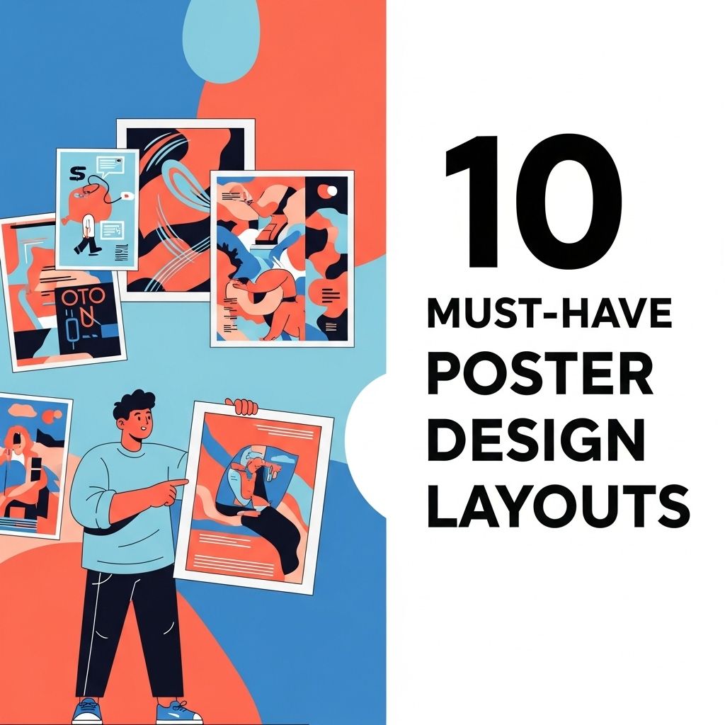
Creating impactful poster designs is an essential skill for graphic designers, marketers, and anyone looking to communicate visually. With the right layout, a poster can convey complex information quickly and effectively, grab attention, and leave a lasting impression. In this article, we will explore ten must-have poster design layouts that can enhance your creativity and help you achieve your design goals.
Understanding the Basics of Poster Design
Before diving into specific layouts, it’s crucial to understand some foundational principles of poster design. A good poster should:
- Grab attention
- Convey a clear message
- Encourage viewers to take action
- Be visually appealing
With these principles in mind, let’s explore various layouts that can be used in poster design.
1. The Grid Layout
The grid layout is one of the most common and effective poster designs. It uses a series of horizontal and vertical lines to divide the poster into sections for organizing content.
Benefits of Grid Layout
- Provides structure and balance
- Allows for easy organization of information
- Facilitates alignment of elements
Example Usage
This layout works best for informational posters, such as event flyers, educational materials, and conference posters.
2. The Z-Layout
The Z-layout leverages the natural reading pattern of a viewer, moving from left to right and top to bottom. This design guides the viewer’s eyes in a Z-shape, making it effective for storytelling.
Best Applications
- Promotional posters
- Product advertisements
- Seasonal campaign materials
3. The Asymmetrical Layout
In contrast to the balanced grid, the asymmetrical layout breaks the rules of symmetry to create an interesting and dynamic composition. This layout can create a sense of movement and energy.
When to Use
Asymmetrical layouts work well for:
- Artistic posters
- Music festivals
- Creative branding
4. The Minimalist Layout
Less is more in the minimalist layout. This design focuses on essential elements, using ample white space and simple typography to convey the message succinctly.
Key Features
- Clean lines
- Limited color palette
- Strong typography
The minimalist layout is perfect for brands that want to convey sophistication and elegance.
5. The Circular Layout
The circular layout uses circles as a central design element, creating a focal point while also allowing for organic flow. This layout can create a sense of unity and harmony.
Ideal For
- Event promotions
- Community gatherings
- Social causes
6. The Typographic Layout
Typography can function as the main design element in this style, where words take center stage. The layout can experiment with font sizes, styles, and placement to create interest.
Considerations
Effective typographic layouts often include:
- Hierarchy through font sizes
- Contrast between fonts
- Creative text alignment
7. The Vintage Layout
Capturing nostalgia, the vintage layout draws inspiration from classic designs, using retro colors and typography. This layout evokes emotions and memories, making it powerful for branding.
Contexts for Use
- Themed events
- Art shows
- Cultural festivals
8. The Photo-Centric Layout
In a photo-centric layout, the imagery takes precedence, often filling the entire background. Text is then layered over the image to complement it rather than compete with it.
Applications
This kind of layout is perfect for:
- Travel posters
- Fashion advertisements
- Film posters
9. The Infographic Layout
When a poster needs to convey complex data or information, an infographic layout is ideal. This design integrates visuals with data, making it easier to digest.
Key Elements
- Charts and graphs
- Icons and illustrations
- Color-coded sections
10. The Interactive Layout
With technology advancing, interactive layouts have become feasible. These posters can include QR codes or links to digital content, allowing viewers to engage with the material on a deeper level.
Usage Scenarios
Ideal for:
- Events with digital components
- Educational demonstrations
- Marketing campaigns
Conclusion
Choosing the right layout for your poster design is crucial for effectively communicating your message and engaging your audience. Each layout has its own unique strengths and ideal use cases, so consider the purpose of your poster before making a decision. Whether you opt for a minimalist layout or an interactive design, the key is to focus on clarity, aesthetics, and engagement. With these ten must-have layouts in your toolkit, you’ll be well-equipped to create eye-catching and memorable posters.
FAQ
What are the essential elements of a good poster design layout?
A good poster design layout should include a focal point, a clear hierarchy of information, balanced use of colors, appropriate typography, and ample white space to enhance readability.
How can color theory impact poster design layouts?
Color theory can greatly impact poster design by influencing emotions and attracting attention. Choosing a color palette that aligns with the message can enhance the overall effectiveness of the poster.
What are some popular poster design layouts for events?
Popular poster design layouts for events include the grid layout, asymmetrical layout, and the rule of thirds layout, each offering unique ways to organize information visually.
How do I choose the right typography for my poster design?
Choosing the right typography involves considering readability, style, and hierarchy. It’s important to select fonts that complement the theme of the poster while ensuring that key information stands out.
What size should I choose for my poster design?
The size of your poster design depends on its purpose and location. Common sizes are 24×36 inches for large displays or 11×17 inches for smaller announcements, but always consider where it will be displayed.
What software is best for creating poster designs?
Popular software for creating poster designs includes Adobe Illustrator, Adobe InDesign, and Canva. Each offers unique tools and flexibility to create visually appealing layouts.