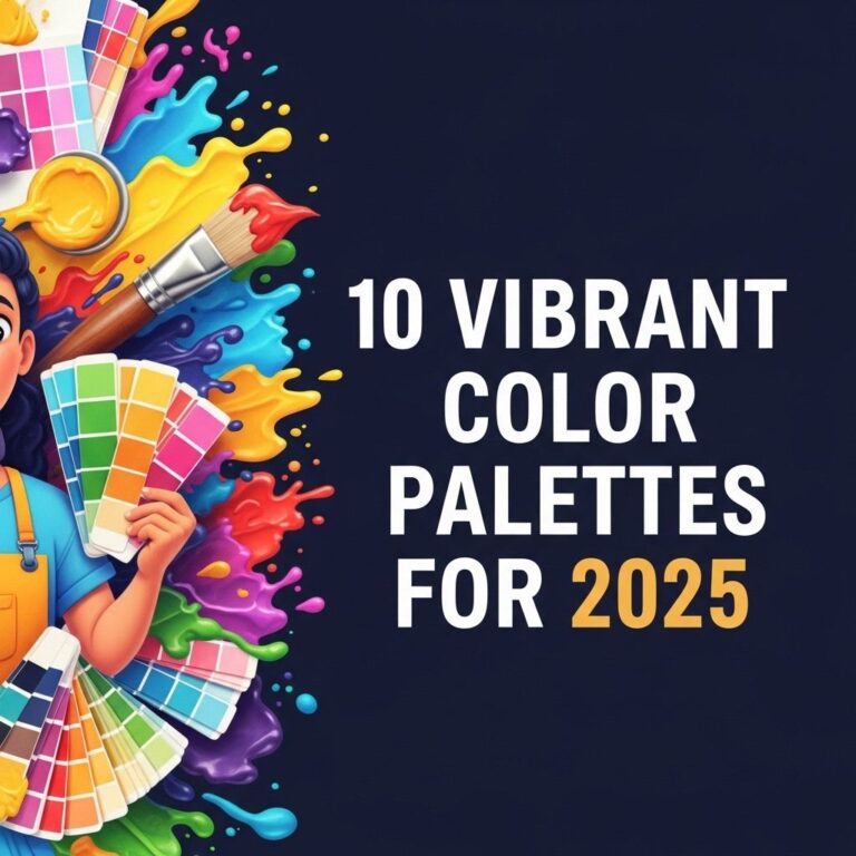
As we step into 2025, the world of design is set to embrace vibrant and innovative color palettes that reflect the evolving cultural landscape. The right color palette can transform a project, evoking emotions and setting the tone for everything from branding to interior design. In this article, we will explore ten stunning color palette ideas that are predicted to dominate the design scene in 2025.
1. Pastel Neon Fusion
The juxtaposition of soft pastel shades with vibrant neon accents creates a playful and energetic atmosphere. This palette is ideal for brands targeting younger demographics or projects that aim to evoke excitement.
Colors:
- Pale Pink
- Mint Green
- Sky Blue
- Neon Yellow
- Bright Coral
Applications:
Perfect for:
- Event promotions
- Fashion collections
- Social media graphics
2. Earthy Tones
As sustainability remains at the forefront of design, earthy tones are making a strong comeback. These colors are inspired by nature and evoke feelings of calmness and stability.
Colors:
| Color Name | Hex Code |
|---|---|
| Forest Green | #228B22 |
| Terracotta | #E2725B |
| Sand Beige | #D6CDA4 |
| Slate Gray | #708090 |
| Deep Brown | #4B3C2D |
Applications:
Ideal for:
- Interior design
- Eco-friendly brands
- Outdoor product packaging
3. Monochromatic Blues
This palette focuses on variations of blue, creating a serene and professional vibe. Monochromatic schemes are excellent for brands that want to convey trust and reliability.
Colors:
- Sky Blue (#87CEEB)
- Royal Blue (#4169E1)
- Navy Blue (#000080)
- Light Steel Blue (#B0C4DE)
- Teal (#008080)
Applications:
Best suited for:
- Corporate branding
- Tech startups
- Finance and banking websites
4. Bold Jewel Tones
Deep, rich colors like emerald green, sapphire blue, and ruby red offer a luxurious and sophisticated feel. This palette is perfect for high-end brands aiming to create an impression of opulence.
Colors:
| Color Name | Hex Code |
|---|---|
| Emerald Green | #50C878 |
| Sapphire Blue | #0F52BA |
| Ruby Red | #E0115F |
| Amethyst Purple | #9966CC |
| Gold (#FFD700) | #FFD700 |
Applications:
Great for:
- Luxury products
- Event branding
- High-fashion marketing
5. Soft Grayscale
A modern take on classic monochrome, soft grays paired with subtle textures can create a sophisticated, minimalist look. This palette is ideal for contemporary design projects.
Colors:
- Charcoal Gray (#333333)
- Light Gray (#D3D3D3)
- Off-White (#F8F8F8)
- Slate Gray (#708090)
- Cool Gray (#A9A9A9)
Applications:
Best for:
- Web design
- Interior architecture
- Branding for consulting firms
6. Sunset Hues
Inspired by the vibrant colors of a sunset, this palette combines warm tones with soft cools, creating a balance that feels both comforting and energizing. It’s a perfect fit for lifestyle brands.
Colors:
| Color Name | Hex Code |
|---|---|
| Peach (#FFDAB9) | #FFDAB9 |
| Coral (#FF7F50) | #FF7F50 |
| Mauve (#EAB8D1) | #EAB8D1 |
| Lavender (#E6E6FA) | #E6E6FA |
| Sky Blue (#87CEEB) | #87CEEB |
Applications:
Suitable for:
- Lifestyle brands
- Health and wellness
- Travel websites
7. Vibrant Tropical Palette
This cheerful palette features lively colors inspired by tropical landscapes, perfect for brands seeking to make a bold statement. It evokes feelings of joy and adventure.
Colors:
- Turquoise (#40E0D0)
- Bright Orange (#FFA500)
- Sunny Yellow (#FFD700)
- Hot Pink (#FF69B4)
- Lime Green (#32CD32)
Applications:
Great for:
- Travel agencies
- Food and beverage products
- Event promotions
8. Retro Neutrals
Blending muted earthy tones with bright retro colors can create a nostalgic yet modern feel. This palette appeals to those drawn to vintage aesthetics.
Colors:
| Color Name | Hex Code |
|---|---|
| Mustard Yellow | #FFDB58 |
| Olive Green | #708238 |
| Rust Orange | #B7410E |
| Dusty Blue | #6A7B9D |
| Burnt Sienna | #E97451 |
Applications:
Suitable for:
- Fashion brands
- Vintage-inspired products
- Art and craft supplies
9. Tech-inspired Color Palette
As technology advances, we see color palettes that reflect innovation and futurism. These colors often include metallic shades and high-contrast combinations.
Colors:
- Electric Blue (#0D76E5)
- Neon Green (#39FF14)
- Metallic Silver (#C0C0C0)
- Cyber Purple (#9B59B6)
- Black (#000000)
Applications:
Perfect for:
- Tech startups
- Futuristic design projects
- Gadgets and electronics
10. Classic Black and White
Timeless and sophisticated, the black and white palette remains evergreen. When executed with attention to detail, it can create stunning visual contrasts and elegance.
Colors:
- Black (#000000)
- White (#FFFFFF)
- Charcoal Gray (#333333)
- Ivory (#FFFFF0)
- Soft White (#F5F5F5)
Applications:
Best for:
- Luxury brands
- Corporate identities
- Editorial design
Conclusion
As we look forward to 2025, these ten color palettes provide exciting options for designers and brands to explore. Whether you’re aiming for playful and energetic or sophisticated and timeless, the right colors can elevate your project and resonate with your audience. By staying ahead of the trends and understanding the emotions different colors evoke, we can create designs that are not only visually appealing but also meaningful and impactful.
FAQ
What are the top color palette trends for 2025?
The top color palette trends for 2025 feature vibrant hues combined with earthy tones, including shades like terracotta, sage green, and bold cobalt blue.
How can I choose a color palette for my home in 2025?
To choose a color palette for your home in 2025, consider your personal style, the mood you want to create, and the latest trends like soothing neutrals or bright accents.
What colors are considered timeless for interior design in 2025?
Timeless colors for interior design in 2025 include soft whites, warm grays, and classic navy, as they complement a variety of styles and settings.
Are there specific color palettes for seasonal decor in 2025?
Yes, seasonal decor in 2025 often includes pastel colors for spring, warm earthy tones for fall, and vibrant jewel tones for winter, aligning with the overall trends.
How do I incorporate bold colors into my design without overwhelming the space?
Incorporate bold colors into your design by using them as accent walls, through accessories, or in artwork, while balancing with neutral tones to create harmony.