
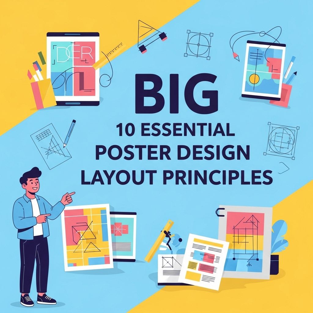
Creating an eye-catching poster requires more than just creativity; it necessitates a firm grasp of design principles. Whether you’re promoting an event, showcasing a product, or conveying a message, understanding layout principles can significantly enhance the effectiveness of your poster. In this article, we will explore ten essential poster design layout principles that every designer should consider.
1. Visual Hierarchy
Establishing a clear visual hierarchy is critical in guiding the viewer’s attention. It helps communicate the message effectively by organizing information based on importance. This can be achieved through:
- Font size and weight
- Color contrast
- Positioning of elements
Tips for Creating Visual Hierarchy
- Use larger fonts for main headers.
- Keep subheaders smaller but distinct.
- Utilize color to highlight key messages.
2. Balance and Alignment
Balance refers to the distribution of visual elements in a poster. Proper alignment creates a clean and organized look while ensuring that no part of the design feels heavy or neglected. There are two types of balance:
- Symmetrical Balance: where elements are evenly distributed.
- Asymmetrical Balance: where different elements are balanced by visual weight.
Creating Balance
To create balance, consider the following:
| Technique | Description |
|---|---|
| Grid System | Utilize a grid to align elements consistently. |
| Whitespace | Incorporate whitespace to prevent overcrowding. |
| Visual Weight | Distribute heavier images with lighter text. |
3. Color Theory
The use of color can significantly affect how a poster is perceived. Color sets the mood, conveys emotions, and can even influence behavior. Understanding the color wheel and color schemes is essential:
- Complementary colors
- Analogous colors
- Monochromatic schemes
Choosing the Right Color Palette
When selecting colors for your poster, consider:
- Your target audience’s preferences.
- The message you want to convey.
- How colors can influence emotions.
4. Typography
Typography is more than just choosing a font; it’s about how text interacts with other elements in the design. Good typography enhances readability and reinforces branding.
Key Typography Principles
- Limit the number of fonts to two or three.
- Ensure readability by choosing clear fonts.
- Adjust letter spacing and line height for better legibility.
5. Focal Point
Every effective poster should have a focal point — the aspect that draws the viewer’s eye first. This could be an image, a headline, or any graphic element. Establishing a focal point helps in creating a story and guiding the viewer’s journey through the poster.
Creating a Focal Point
To create a compelling focal point, consider the following:
- Use contrast to make it stand out.
- Position it according to the rule of thirds.
- Incorporate movement in design elements leading to it.
6. Consistency
Consistency is key in design, as it creates a cohesive look across all elements of your poster. This includes colors, fonts, and graphic styles.
How to Maintain Consistency
To keep your design consistent:
- Create a style guide before starting your design.
- Stick to a limited color palette and font selection.
- Use uniform sizing for similar elements.
7. Breathing Space
Breathing space, or whitespace, is crucial in design. It prevents a cluttered look and allows the eye to rest, making information easier to digest.
Utilizing Whitespace Effectively
To leverage whitespace:
- Don’t be afraid to leave areas of your poster empty.
- Use margins to frame your content.
- Group related elements together for better organization.
8. Imagery
Images can communicate messages quickly and effectively. The right visuals can enhance your poster’s impact and make it memorable.
Choosing the Right Imagery
When selecting images, keep in mind:
- Relevance to the topic or theme.
- Quality and resolution to maintain professionalism.
- How the image interacts with the text.
9. Informational Hierarchy
In posters that convey detailed information, creating an informational hierarchy is essential to guide the viewer through the content logically. This involves organizing content from most to least important.
Structuring Information
To effectively present information:
- Start with the most crucial details.
- Follow up with supporting content and details.
- Conclude with a call-to-action or summary.
10. Testing and Feedback
Finally, before finalizing your poster, testing and feedback are invaluable. A second pair of eyes can often catch issues or provide insight that you may have overlooked.
Gathering Feedback
To gather effective feedback:
- Show your design to a diverse audience.
- Ask specific questions regarding clarity and appeal.
- Be open to constructive criticism.
In conclusion, mastering these ten essential poster design layout principles will not only enhance the visual appeal of your posters but also ensure that your messages are communicated effectively. By applying these principles thoughtfully, you can create posters that stand out and leave a lasting impression on your audience.
FAQ
What are the key principles of poster design?
The key principles of poster design include balance, contrast, alignment, repetition, and hierarchy.
How important is color in poster design?
Color is crucial in poster design as it conveys emotions, attracts attention, and reinforces brand identity.
What role does typography play in poster design?
Typography plays a vital role in poster design by ensuring readability, setting the tone, and creating visual interest.
How can I achieve balance in my poster design?
Balance can be achieved by distributing visual weight evenly, either symmetrically or asymmetrically, to create a harmonious layout.
What is the significance of using images in poster design?
Images enhance visual appeal, communicate messages quickly, and engage the audience’s attention effectively.
How can I ensure my poster design is effective?
To ensure effectiveness, focus on a clear message, strong visual hierarchy, and a cohesive design that resonates with your target audience.
