
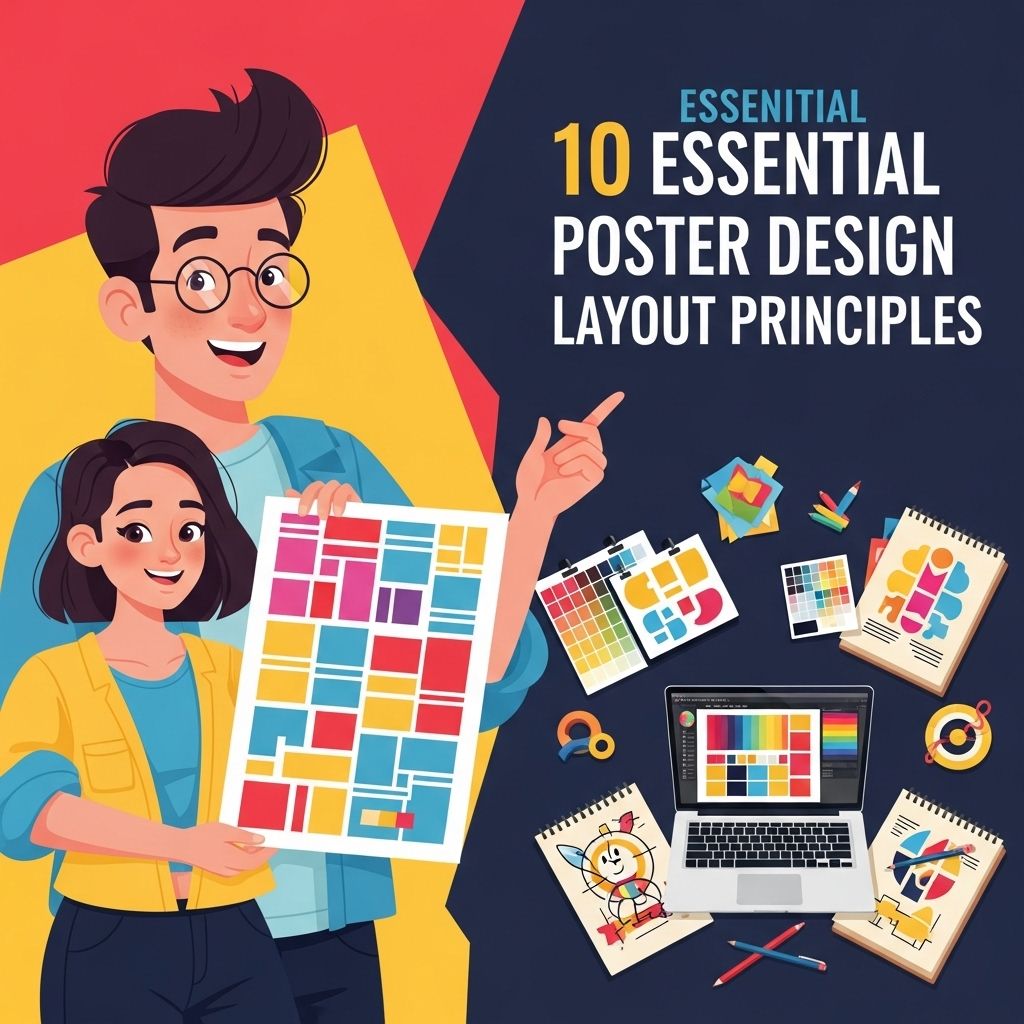
In the realm of graphic design, poster creation stands as a unique challenge that melds creativity with strategic thinking. The essence of a compelling poster lies not only in its visual appeal but also in its ability to communicate a message effectively. Whether for advertising an event, promoting a brand, or conveying information, understanding the fundamental principles of poster design layout is crucial. This article delves into the ten essential principles that every designer should consider while crafting impactful poster layouts.
1. Balance: Visual Weight Distribution
Balance in design refers to the distribution of visual weight within the layout. A well-balanced poster can effectively guide the viewer’s eyes across the design. There are two types of balance:
- Symmetrical Balance: Elements are arranged evenly on either side of a central axis, creating a mirror effect.
- Asymmetrical Balance: Elements are distributed unevenly, yet still maintain equilibrium through size, color, and placement.
Examples of Balance
When designing posters, consider how different elements interact. For instance:
- Placing a large image on one side and balancing it with multiple smaller text boxes on the opposite side.
- Using contrasting colors to create a focal point that draws attention while still maintaining overall balance.
2. Hierarchy: Guiding the Viewer’s Attention
Hierarchy is pivotal in organizing information to lead the viewer through the content intuitively. By emphasizing certain elements over others, designers can create a visual path that directs focus effectively. This can be achieved through:
- Size: Larger elements draw more attention.
- Color: Bright or contrasting colors can help highlight important information.
- Placement: Elements placed higher on the poster typically receive more attention first.
Implementing Hierarchy
To create a clear hierarchy in your poster:
- Use different font sizes and weights for titles, subtitles, and body text.
- Incorporate contrasting colors for critical information.
- Ensure clear spacing between elements to avoid clutter.
3. Alignment: Creating Connection and Consistency
Alignment involves placing elements in relation to each other and to the overall layout. Proper alignment fosters a sense of order and professionalism. Key alignment types include:
- Left Align: Commonly used for text-heavy designs.
- Center Align: Offers a formal look, ideal for posters with minimal text.
- Right Align: Less common but can create a unique aesthetic when used thoughtfully.
Best Practices for Alignment
To ensure effective alignment:
- Utilize grids to help position elements precisely.
- Stick to one alignment style to maintain consistency throughout.
- Align text blocks with images to create a cohesive look.
4. Contrast: Enhancing Readability and Impact
Contrast adds visual interest and aids in readability. It can be achieved through differences in color, size, and shape. Key aspects to consider include:
- Color Contrast: Use complementary colors to make text stand out against the background.
- Size Contrast: Pair large and small elements to create a visual dynamic.
- Shape Contrast: Combine geometric shapes with organic forms for depth.
Using Contrast Effectively
To utilize contrast in your design:
- Choose a color palette with high contrast for important elements.
- Incorporate bold typography for headlines against softer backgrounds.
- Pair circular elements with rectangular ones for visual variety.
5. Space: Breathing Room for Elements
Negative space, or whitespace, is the unoccupied area around and between elements. It plays a significant role in design by preventing clutter and enhancing focus. Effective use of space leads to:
- Improved readability
- Greater emphasis on important elements
- A cleaner overall appearance
Maximizing Space
To maximize the impact of negative space:
- Avoid overcrowding elements; allow for breathing room.
- Use padding around text and images for clarity.
- Experiment with the layout to find the right balance of space.
6. Color Theory: Conveying Mood and Emotion
The choice of colors in a poster can drastically affect its emotional impact. Color theory provides guidelines on how colors interact and what feelings they evoke. Key concepts include:
- Complementary Colors: Opposite colors on the color wheel that create dynamic contrasts.
- Analogous Colors: Colors next to each other that create harmonious designs.
- Monochromatic Colors: Variations in lightness and saturation of a single color for a cohesive look.
Implementing Color Theory
To effectively implement color theory:
- Select a color scheme that aligns with the mood of your message.
- Limit your palette to 2-3 main colors for simplicity.
- Test colors on different backgrounds to ensure legibility and effectiveness.
7. Typography: The Art of Text
Typography is more than just choosing a font; it involves the arrangement of text in a visually appealing and readable manner. Considerations include:
- Font Choice: Select fonts that reflect the theme and tone of your poster.
- Font Size: Ensure text is legible from a distance.
- Line Spacing: Adjust line spacing for comfort and readability.
Typography Best Practices
To enhance typography in your designs:
- Limit the number of fonts to two or three for consistency.
- Use varying font weights to establish hierarchy.
- Avoid overly decorative fonts that hinder readability.
8. Imagery: Visual Storytelling
Imagery plays a critical role in conveying a message quickly and effectively. High-quality images can enhance a poster’s appeal and communicate a narrative. When choosing imagery, consider:
- Relevance: Images should relate directly to the content or theme.
- Quality: Use high-resolution images to maintain clarity.
- Style: Ensure images match the overall design style of the poster.
Selecting Imagery
To select impactful imagery:
- Consider using original photographs or custom illustrations.
- Integrate images that evoke the desired emotional response.
- Ensure images do not overwhelm text but complement it.
9. Consistency: Reinforcing Brand Identity
Consistency throughout a poster design reinforces brand identity and creates a professional appearance. Key aspects include:
- Brand Colors: Use brand colors consistently to evoke recognition.
- Font Choices: Stick to the same font families to maintain coherence.
- Visual Elements: Repeated use of logos and graphic styles can strengthen brand identity.
Ensuring Consistency
To ensure consistency in your design:
- Create a style guide for reference during the design process.
- Review all elements to confirm they align with brand standards.
- Conduct peer reviews for feedback on consistency.
10. Purpose: Defining the Design Objective
Every successful poster must have a clear purpose. Understanding the goal of the poster shapes the design process. Whether the objective is to inform, persuade, or entertain, clarity of purpose drives design choices. Consider the following:
- Target Audience: Know your audience to tailor the message and design.
- Message Clarity: Ensure the main message is unmistakably conveyed.
- Call to Action: Include a clear call to action (e.g., “Buy Tickets,” “Visit Us”) to guide the audience’s next steps.
Defining Your Poster’s Purpose
To define a clear purpose in your poster:
- Identify the key message you want to communicate.
- Establish goals for what you want the audience to do after seeing the poster.
- Keep the design focused on supporting that purpose.
In conclusion, mastering these ten essential principles of poster design layout can elevate your projects from mundane to magnificent. By balancing creativity with structured design principles, you can create posters that not only capture attention but also convey messages powerfully and effectively. Armed with this knowledge, designers can step into the world of poster design with confidence, ready to produce visually stunning and meaningful works.
FAQ
What are the key principles of poster design?
The key principles of poster design include hierarchy, balance, contrast, alignment, repetition, and space management.
How important is hierarchy in poster design?
Hierarchy is crucial in poster design as it guides the viewer’s eye to the most important elements first, ensuring effective communication.
What role does color contrast play in poster design?
Color contrast enhances readability and visual appeal, making elements stand out and attracting attention to key information.
Why is alignment significant in poster layouts?
Alignment ensures that elements are visually connected, creating a clean and organized look that improves overall design coherence.
How can repetition enhance a poster’s design?
Repetition of colors, fonts, and shapes creates unity and reinforces the overall theme of the poster, making it more memorable.
What is the importance of white space in poster design?
White space, or negative space, helps to avoid clutter, enhances readability, and allows the viewer to focus on the key message.
